SuperCity
Case study
SuperCity is true to its name. The company is trying to make cities more super. (Duh, right?) And they’re doing this via their AI-powered solution that centralizes cities’ communication, services and information for residents and visitors into one intuitive app.
We hopped on the collaboration with SuperCity mid-way in their brand definition process. They already had a logo and a base for visual identity, but they wanted to take it up a notch. And they needed a website – one that is short and sweet, but demonstrates everything the company stands for: Expertise, professionalism, and a little bit of that ‘super’ factor.
Visual design
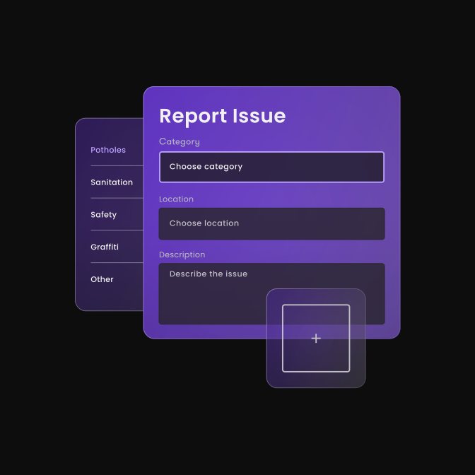
Black is used as the main background color, softened with a subtle gradient to make it easier on the eyes. It’s supported by purple as the primary accent, while white and grayscale tones help establish visual hierarchy and add depth. Gradients are also used throughout the interface to gently separate content modules and expand the palette without introducing additional colors. The color scheme mirrors the one used in the SuperCity app to ensure consistency across all touchpoints.
Typography
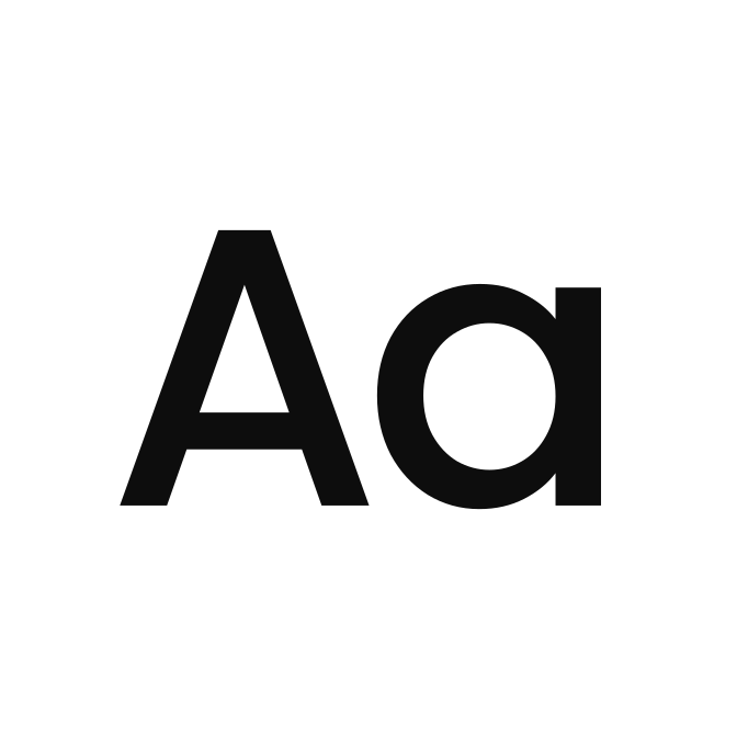
We chose a typeface with a pleasant, simple character — one that looked good and was practical enough to use across all media, from branding to the app.
Poppins is a neutral, open-source typeface from Google Fonts that performs well in both interface and editorial use. Its simplicity and wide availability make it a practical choice for digital environments.


Site mapping and content design
As part of the project, we defined a new site map for SuperCity’s web and overall architecture of the website: number of subpages, their hierarchy, and the structure of website components, navigation, key web elements, linking logic, and CTAs - optimized for the devices that the web will be displayed on - and the audience of respective landing pages. We logically structured it to guide every type of visitor at any stage of the marketing funnel toward the right content. We kept navigation simple, purposeful, and built to convert.
As for content design, using the inverted pyramid principle, we designed functional wireframes with the goal of stating the benefits of the SuperCity platform as early into the page as possible - bearing in mind the need to communicate the main value propositions as effectively and as early on as possible.
Copywriting
In the web copy, we prioritized clarity and product-focused messaging. SuperCity is a software solution, and a new brand – which means we have to introduce it and state out right what the product does and what benefits it brings. We added a few brand-inspired copies, using the word ‘super’ as the carrier of the brand writing. The ratio is approximately 80/20 - clarity of messaging over more brand-building copy.

Web design
Once the wireframes were finalized and approved, the design phase began – designing the web components or modules that make up the website. This is where the brand communication design takes shape.
The website’s visual language is typical for a SaaS company: clean layouts, focused messaging, and a clear sense of purpose. The goal was to make it obvious what kind of product and industry visitors are looking at, while keeping the tone friendly and relevant for both governments and residents.
Minimal layout, high contrast, a limited color palette, and a sans serif font, paired with strong, concise headlines. What we wanted to do differently is bring in more of a human feel, especially by using imagery and sparse use of the new SuperCity mascot that makes the experience warmer and more relatable.

Product visuals & web imagery
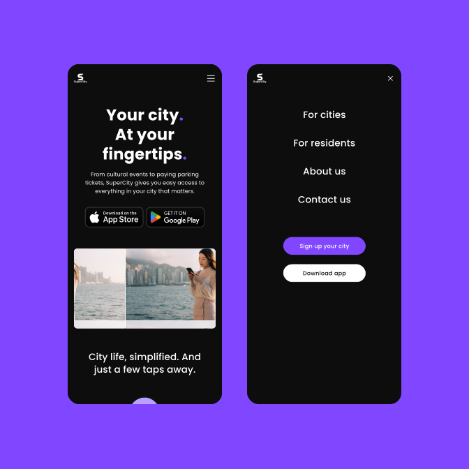
Rather than relying on standard UI mockups using devices, the website features visuals that combine real product screens with subtle gradients, transparency, and noise effects. It’s a more appealing way of showcasing SuperCity’s capabilities, while keeping the real product at the center. Percy, the brand mascot, is used sparingly to add a friendly tone in select moments – for example on the 404 page or in pop-up banners.
Mascot creation
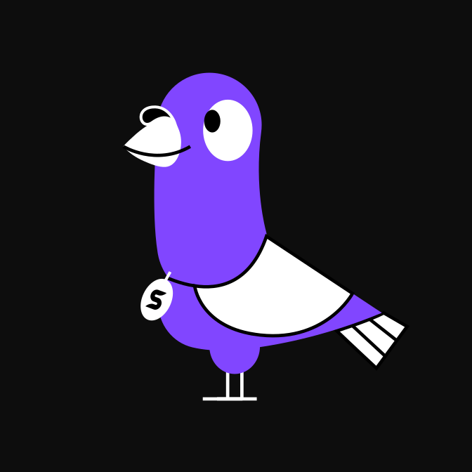
For SuperCity, we created a custom brand mascot: Percy the Pigeon. Inspired by the age-old role of pigeons as messengers and community dwellers, Percy represents how SuperCity does things: They’re bold, fun, and grounded. At first, the idea raised some eyebrows (“Pigeons are dirty,” a few people told us), but we trusted our creative instincts, and so did the SuperCity team.
We wanted a mascot that stood out, not something forgettable or playing it safe. Pigeons are part of every city so it had to be a pigeon. Percy made his debut at the app launch in El Paso, Texas, where he was a hit. He appeared on jumbotrons, embroidered jackets, and coasters. People even lined up to take photos with his wings!


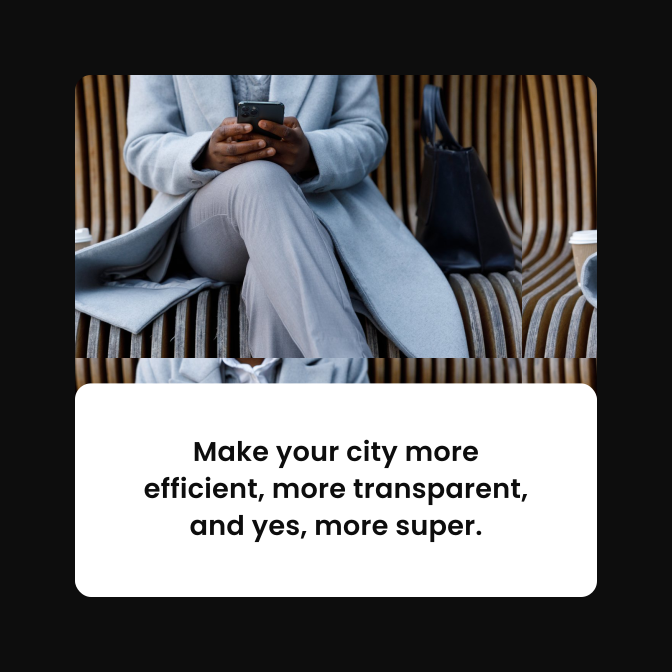
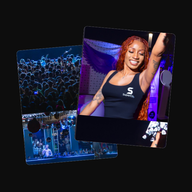
Photography plays an important role in adding warmth and relatability to the website. The imagery shows diverse residents in everyday urban contexts: at events, commuting, parking, or enjoying public spaces. All photographs share a consistent visual style: high-quality, bright, and energetic, with slightly elevated saturation and tones that complement the core color palette.

Web implementation & integrations
Seeing as SuperCity had their original web hosted on SquareSpace, we initially worked with two options: 1/ move their web to other, more easily customizable environment - e.g. WordPress 2/ keep SquareSpace as the content management system (CMS) despite some coding design/coding it may bring. Since the SuperCity team was more inclined towards keeping SquareSpace as their web platform, we prepared to work with this option.

Although Squarespace has its specifics and template limitations, we extended its functionality through advanced customization and ensured easy future editing. After aligning design and coding decisions, we have delivered a responsive, technically sound website that is 1:1 with web design.
Main tools are a high-quality Squarespace template with Fluid Engine for granular control over layout and Squarespace’s built-in style editor for base design elements (colors, fonts, spacing). We used custom CSS injections and Code blocks/external code for overriding template limitations or fine-tuned behavior not available in the built-in editor. The website also required us to integrate the website with several other tools, such as Legal and privacy provider or Linkedin widget plugin.
- Client: SuperCity
- Art direction: Tamara Shirin Shawkatova
- Web design: Tamara Shirin Shawkatova
- Mascot illustration: Katka Schwarz
- Content design & copywriting: Katy Mrvova
- Web implementation: Martin Križo
- Brand definition & visual identity
- Brand guidelines
- Web design
- Copywriting
- Web implementation