Intterio
Catalogue
Intterio is a family-owned interior design and furniture company with in-house production, focused on delivering exclusive, high-quality solutions for both residential and commercial spaces. At the heart of Intterio’s work is the blend of traditional craftsmanship and modern aesthetics.
When we were approached to create their 2025 catalogue, the brief was clear: deliver a 130+ page bilingual magazine with a nearly impossible deadline. We had less than two weeks to complete and prepare the entire publication for print. With multiple clients on our desks and a hard print deadline looming, we took the challenge. And delivered.
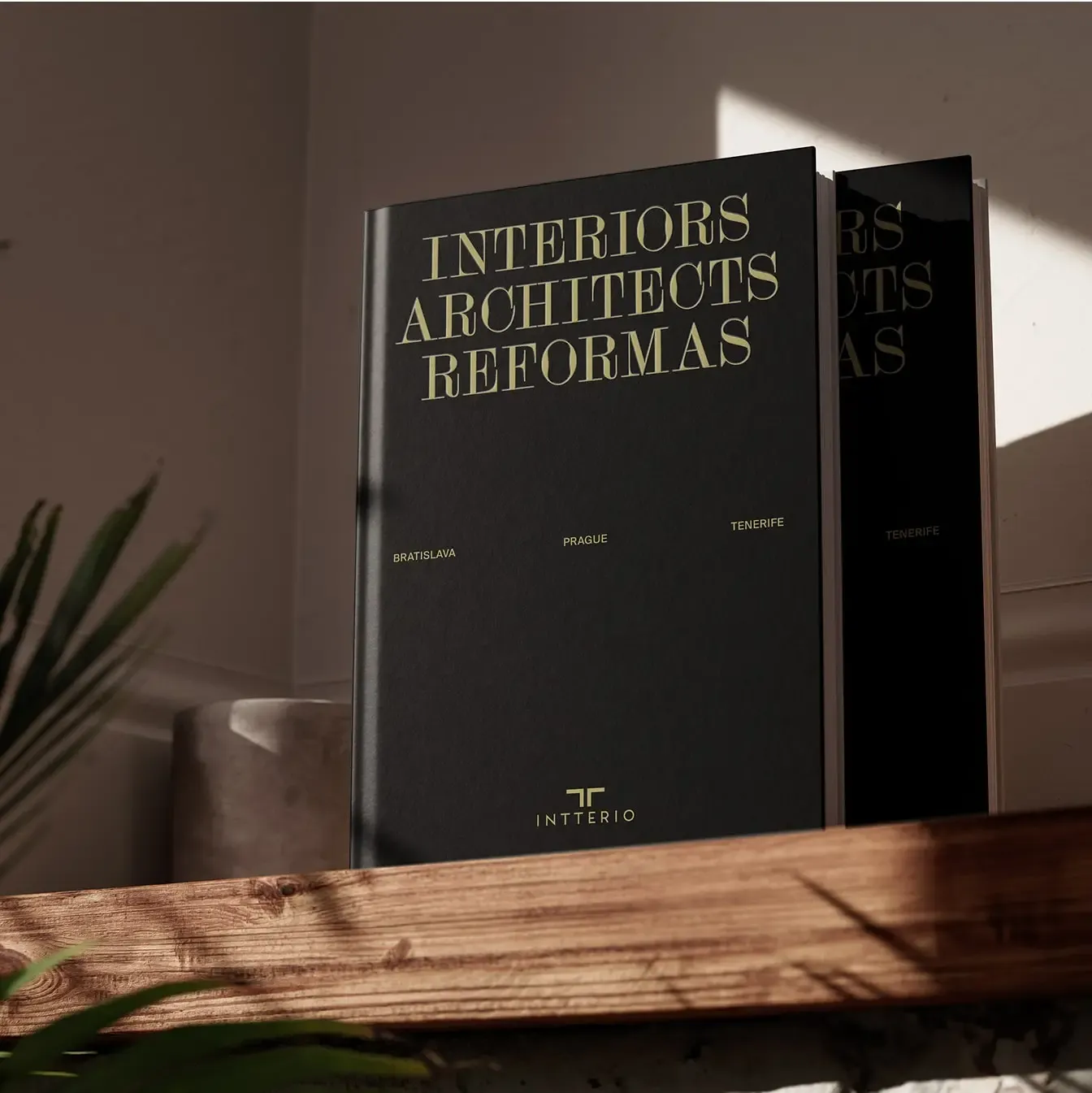
Editorial design
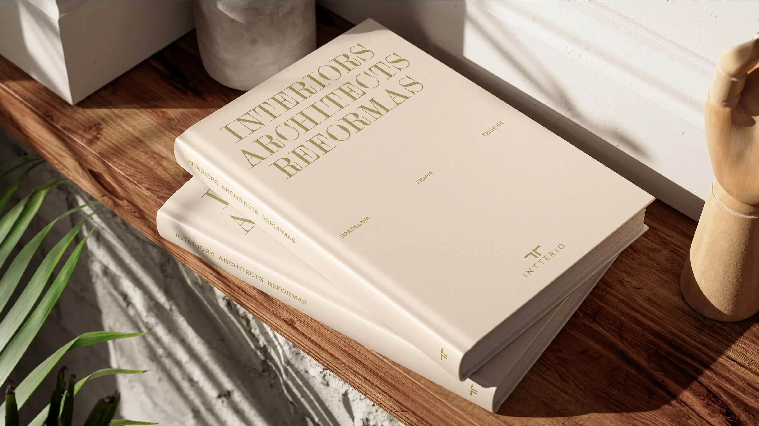
The editorial design is inspired by the mood, materials, and craftsmanship of the interiors created by Intterio. The result is a catalogue that feels both quietly luxurious and functionally clear.
White space, structure, and subtle details play a key role. The design doesn’t shout. It speaks with confidence. Each section was designed to elevate the high-quality photography and renders, allowing the interiors to take center stage, while text and layout served to frame and complement the work with elegance.
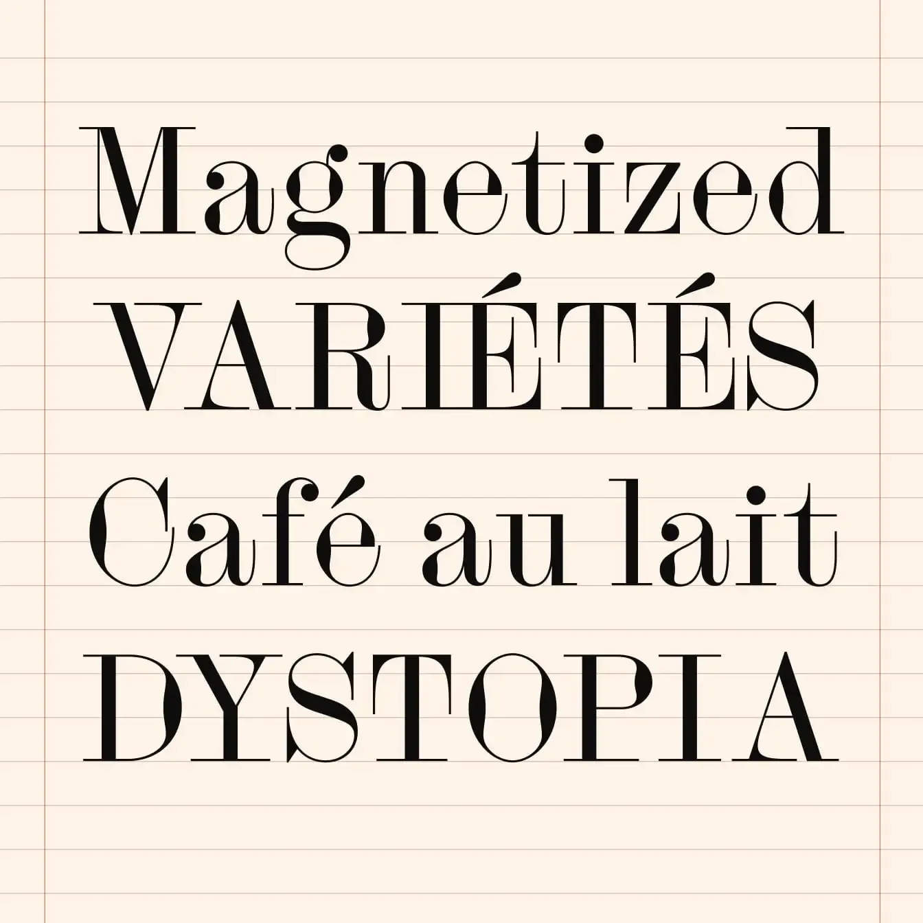
Typography
The magazine uses two carefully selected typefaces. For the display typeface, we selected Siluett, designed by Andree Paat (Kirjatehnika). Siluett’s sharp elegance and expressive forms add just the right amount of personality to headlines, helping us craft a premium feel without unnecessary ornamentation.
As for the text typeface, we went with Suisse Int’l, designed by Ian Party (Swiss Typefaces). Suisse Int’l, rooted in the tradition of the Swiss Style, brings clarity, structure, and neutrality to body text, captions, and navigation.
Siluett Regular Kirjatehnika
Copywriting
The entire magazine is bilingual – written in English and Spanish, covering everything from editorial storytelling to apartment realizations descriptions, brand messaging, and microcopy across navigation and callouts.
The text had to say a lot – in very little space. We created concise text for 13 apartments, each needing an individual voice – while still staying consistent with the Intterio brand tone. Headlines were crafted to evoke exclusivity without sounding pretentious. Descriptions blended lifestyle storytelling with architectural detail.
Layout
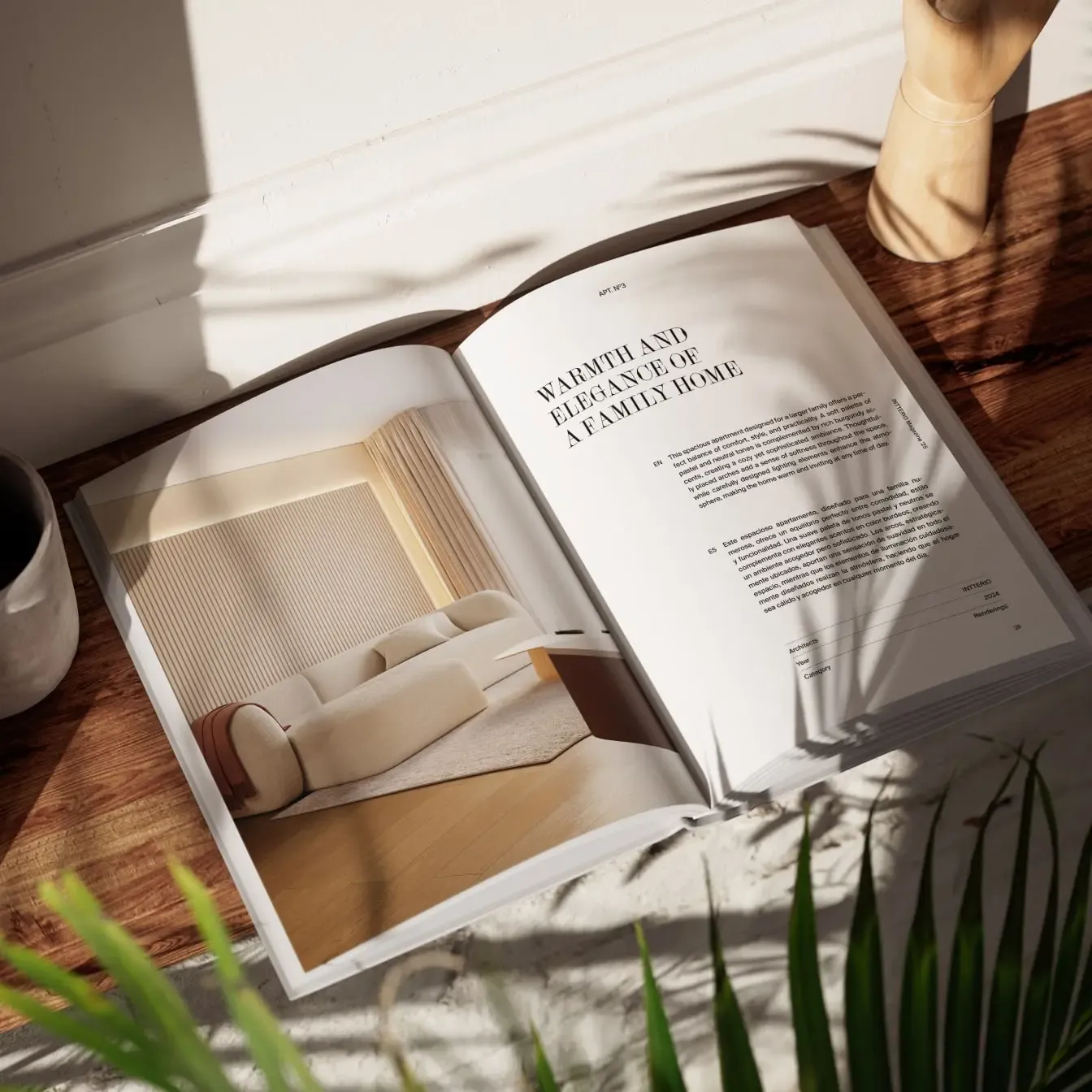
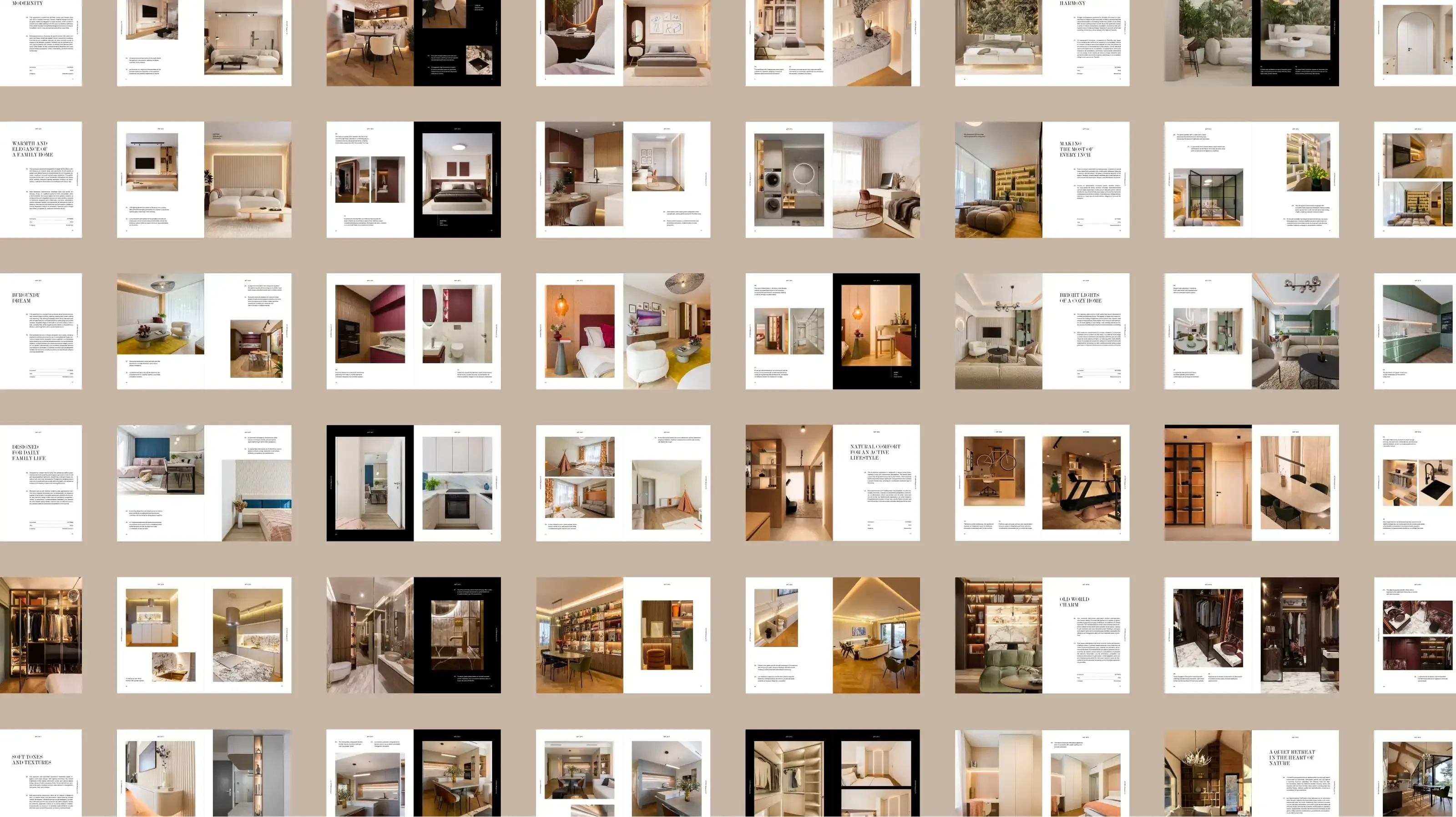
The layout is built on a precisely calculated invisible grid, derived from the width and height of each catalogue spread. Text follows a baseline grid, aligned to the same logic, ensuring typographic harmony across all pages.
The overall design is visual-first, with full-page photographs and 3D visualizations of interiors complemented by subtle, margin-based navigation and captions. The grid gave us the structure; the content brought it to life.
- Client: Intterio
- Art direction & editorial design: Tamara Shawkatová
- Copywriting: Katy Mrvová
- Typography: Siluett (Kirjatehnika), Suisse Int’l (Swiss Typefaces)
- Cover design
- Editorial design
- Copywriting (EN/ES)
- Print production support
- Art direction