Publiq
Case study
Publiq is a community engagement app focused on the construction, energy, and local government sectors. It works like an interactive bulletin board where organizations share news, updates, and project progress – except residents and stakeholders can also respond, ask questions, participate in polls or surveys, and voice their concerns.
Our first interaction with Publiq started something like this: "We need a new logo. Can you help?" Fast forward a few months, we delivered not just a logo, but a complete visual identity, web design, and new brand messaging.
We kicked off the project with a brand sprint workshop, using targeted exercises to explore key aspects of the brand, including its core values, purpose, target audience, personality, and story. Over a three-hour session, we sat down with three of Publiq’s executives to define the brand’s unique positioning that would shape its visual identity, tone of voice, and copywriting direction. This session aligned all of us on expectations for the website redesign, laying a foundation for the next phases of the project.
Brand concepts
During the exploratory phase, we audited Publiq’s existing website and marketing materials, building on insights from the brand sprint. Using this foundation, we developed a brand concept that was later refined through collaborative discussions and feedback sessions.
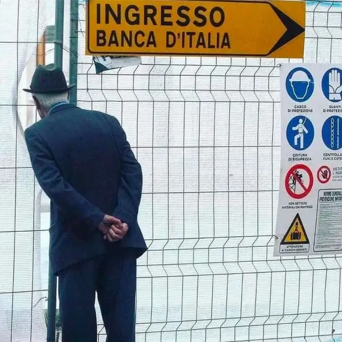
At the heart of the brand concept we created for Publiq is a simple idea: transformation should connect, not divide.
Like the umarelli — elderly men in Italy who watch over construction sites with genuine curiosity — we believe people want to understand what’s being built around them. Publiq embraces that curiosity and channels it into meaningful engagement. We saw an opportunity to turn this emotion into a brand built on the idea of turning barriers into bridges. The result is a visual identity that aligns with the company’s vision and feels authentic to the people behind Publiq.

Logo development
The logo development process involved exploring symbolism and distinctiveness, experimenting with different shapes, combinations, and weights to achieve the right balance between clarity, flexibility, and brand recognition.
The chosen visual identity features a distinctive logo icon used across brand and marketing assets and as the app icon. Inspired by the brand name, the icon resembles the letter “P” while symbolizing Publiq’s human-centric mission – connecting developers and local governments with residents.
Brand guidelines
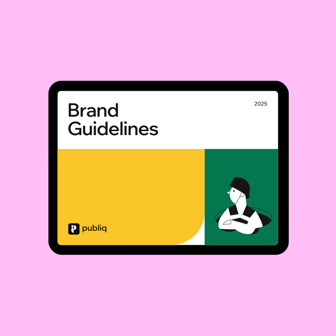
To ensure a consistent brand presence, we created for Publiq a comprehensive brand book – a document outlining all key aspects of the brand’s visual identity. The guidelines cover logo usage, color palette, typography, imagery, illustration style, and tone of voice, defining the foundation of Publiq’s visual communication.
Throughout the process, we carefully structured and refined these elements into a clear, practical guide that both Publiq’s internal team and external collaborators can rely on.
“We were looking for a boutique studio to collaborate with, and I’m so glad we found yours. From day one, you brought dedication and care to this project. We’re absolutely thrilled with the result and so are our customers. Thank you.”


Color palette & typography
The color palette we chose for Publiq balances clarity and energy, with off black and white as the primary colors for text-heavy sections to ensure maximum readability. Vibrant accent colors — green, yellow, pink, and blue — are used in illustrations and text-free sections, keeping the design fresh and modular.
We picked Wix Madefor Display for bold, attention-grabbing headings and Wix Madefor Text for clear, readable body copy — modern Google Fonts suitable for a SaaS company.
Photography
For Publiq, we chose a photography style that captures real people and genuine moments in public spaces — reflecting the brand’s focus on community and engagement. We prioritized high-quality images with natural outdoor lighting, neutral tones, and subtle branding. Our goal was to showcase authenticity and simplicity, with a strong emphasis on diversity, inclusivity, and positive emotions.


Illustration style
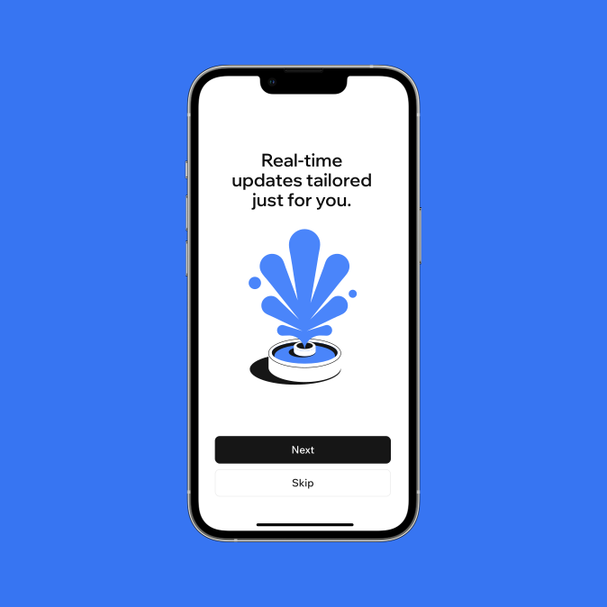
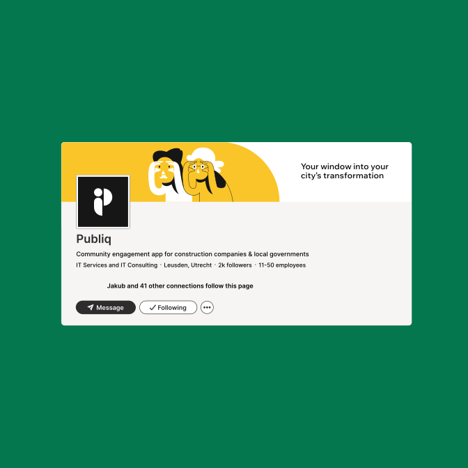
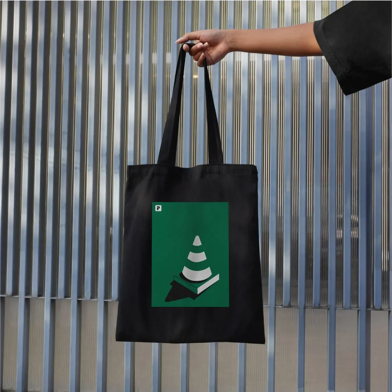
To visually communicate abstract concepts, we developed a custom vector illustration style for Publiq. These illustrations are simple and friendly, focusing on themes like residents in public spaces, construction sites, and other elements that reflect the dynamic life of communities. They serve as a playful yet practical tool to express ideas that are hard to capture in photos, evoke emotion, and help explain features or abstract concepts.
We use solid colors and negative space to create clean, modern visuals with a distinct personality. The color palette is intentionally limited to one brand color, complemented by black and white, to ensure consistency and strong brand recognition across all materials.
Brand messaging and tone of voice
We worked with Publiq’s team to refine their messaging, making sure it resonates with its diverse audience groups. Using the Jobs to be Done framework, we explored the unique problems and desires of each audience segment and crafted a set of clear, impactful messages.
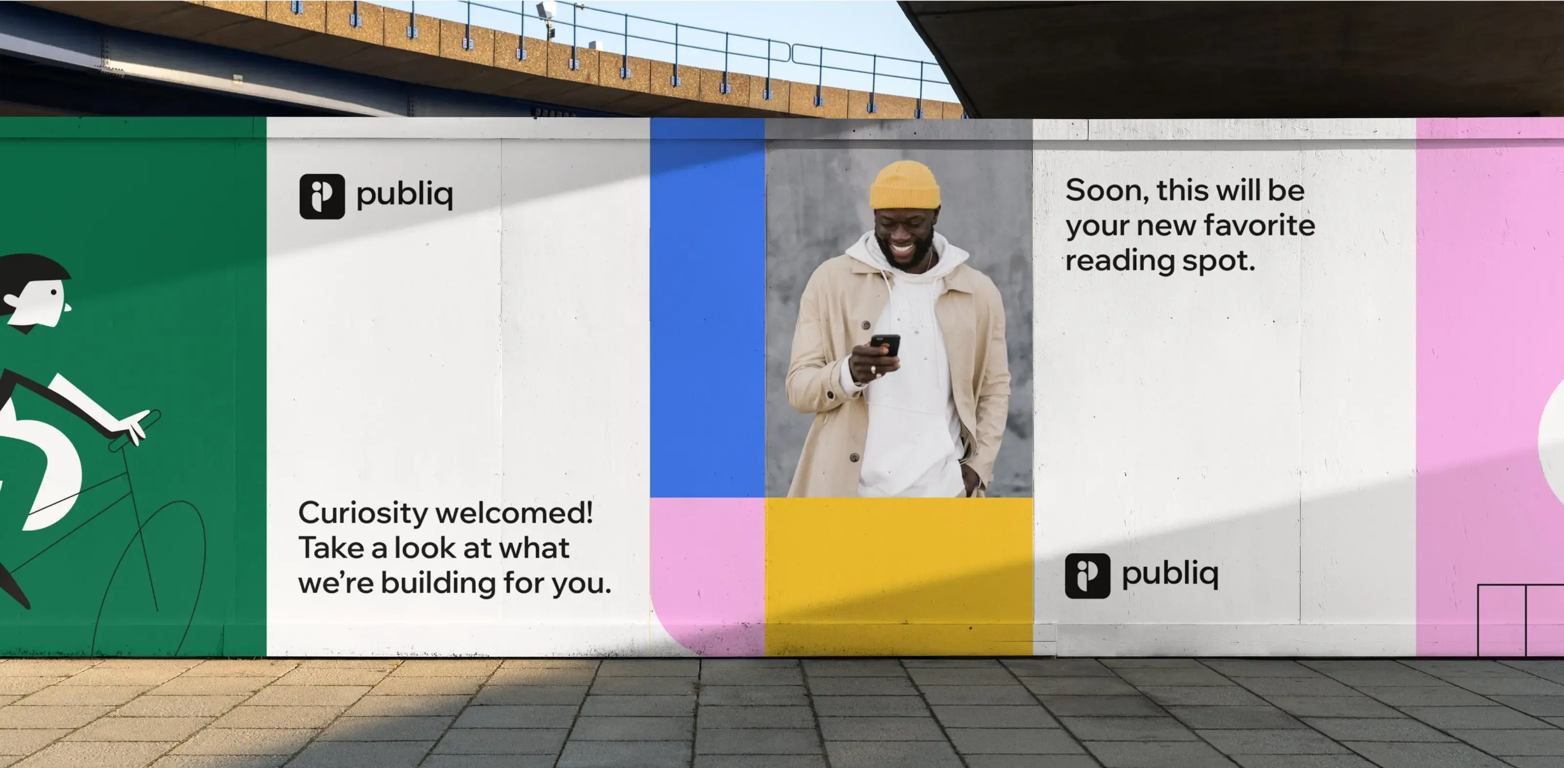
We defined Publiq’s product value propositions, which served as a foundation for the website copy and broader communication strategy, and came up with a set of more playful messaging style for lighter contexts – such as merch or out-of-home advertising.
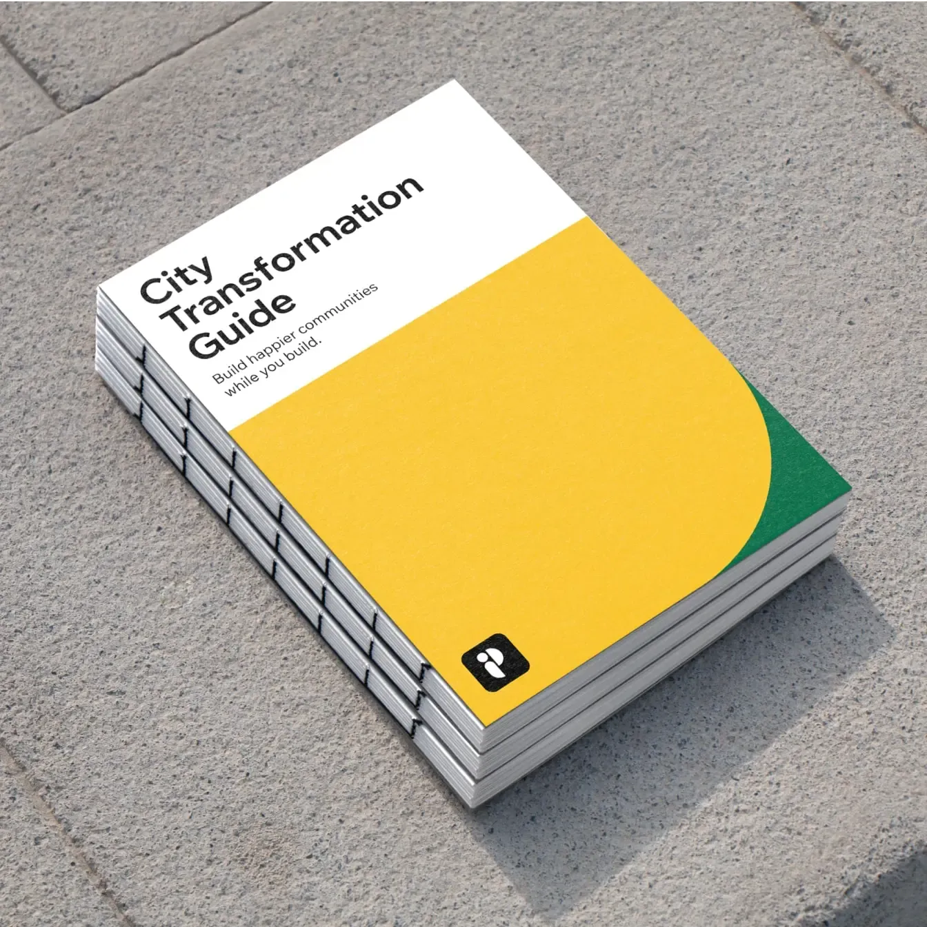

During this process, we helped shape a distinct tone of voice that aligns with Publiq’s values and positioning. These resulted in the Voice & Tone guidelines – included in the Brand guidelines document.

Wireframing, content design & web copywriting
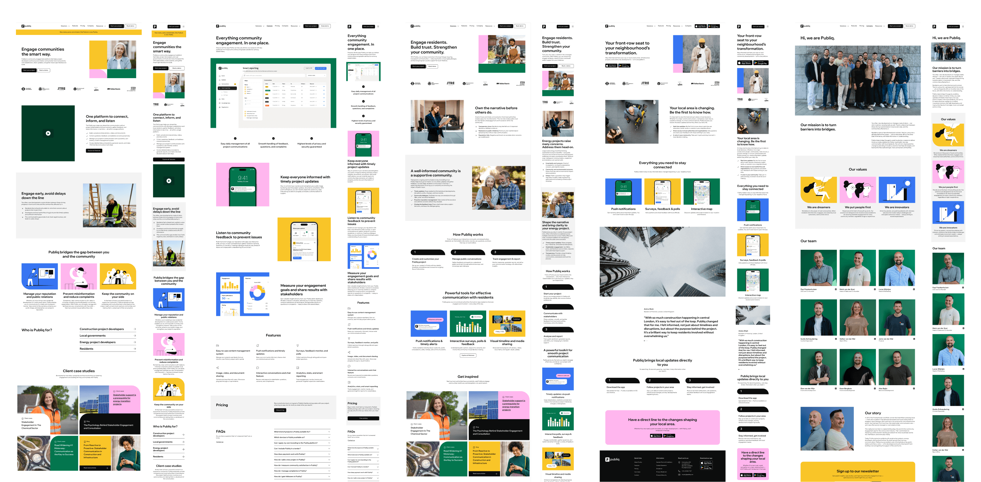
As part of this process, we defined modular website components that adapt to different content needs and usage contexts, ensuring consistency across the entire site. Compared to the company’s previous website, the new layout makes better use of space, improves information hierarchy, and enhances navigation and user experience.
We took extra care optimizing the placement of primary and secondary buttons, ensuring they align with the customer journey and sales funnel for a logical, user-friendly flow that guides visitors toward key actions.
We crafted the first copy drafts based on the messaging and tone of voice established earlier in the project. Through collaborative feedback rounds, we refined both the copy and wireframes, preparing them for the website’s visual and technical development.
Web design
For Publiq, we designed a simple, clean, and highly functional website. It follows a logical structure, using an 8-point grid system for spacing and alignment. The white background allows for easy modular rearrangement and creation of new subpages. Buttons are kept black and white, with colors reserved for visuals. The design incorporates both photography and illustration, with a clear logic behind their use – each serving distinct purposes.
As part of the web design process, we created a web style guide and UI library to maintain consistency across the site and provide a flexible system for building new pages and components. As standard, we designed for both desktop and mobile to deliver a fully responsive experience across all devices. The result is a clean, structured, and easy-to-navigate website.
“The collaboration has been inspiring, constructive, and full of energy – just how you'd want a rebranding to go. Publiq looks amazing. Thanks to your dedication and creativity, we now have a brand that truly stands strong.”


- Client: Publiq
- Visual identity: Tamara Shirin Shawkatová
- Web design: Tamara Shirin Shawkatová
- Copywriting: Katy Mrvová
- Web development: SUM Digital
- Logo & visual identity
- Brand guidelines
- Brand & communication assets
- Web design
- Copywriting & messaging