Datamolino
Case study
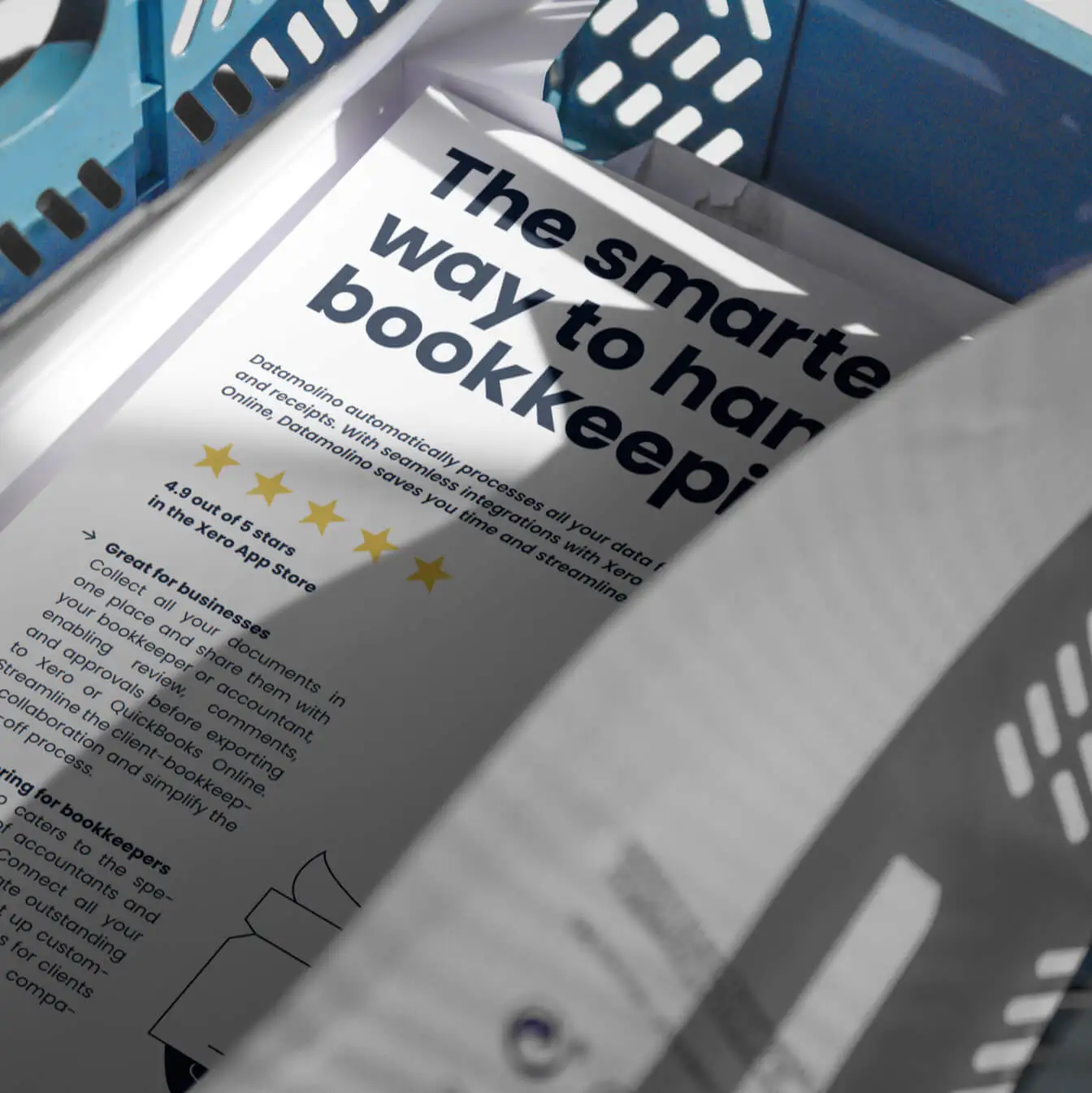
Datamolino is an invoice processing software company with over 10 years on the market. The team planned a complete redesign and custom development of their website, which hadn’t been updated in some time. They approached us to lead the project and update their brand identity along the way.
As the company’s key marketing asset, the website needed a refresh. Besides a visual update, Site Project also delivered improvements in web architecture, navigation, and brand messaging, ensuring it aligns more closely with Datamolino’s vision and growth.
Phase one

Initial discussions and website audit
We kicked off the project with a series of in-depth discussions with the Datamolino team to fully understand their objectives and expectations. We conducted an audit of the company’s existing visual communication and website, identifying key areas for improvement. The website had a somewhat cluttered appearance and lacked a clear visual language. We also uncovered some structural issues and inconsistencies in hierarchy and the use of web modules.

Phase two
Brand sprint workshop
As part of the prep phase, we conducted a half-day brand sprint workshop with Datamolino’s leadership team. The goal was to distill the essence of the brand and define the trajectory for its future brand strategy. Through structured exercises, we explored the company’s core values, unique selling points, and target audiences. The brand sprint played a crucial role in shaping the visual language, tone of voice, and copywriting direction, while also ensuring alignment on expectations for the website redesign.
Phase three
Exploration and creating stylescapes
Following the brand sprint, we initiated the exploratory phase, creating mood boards, experimenting with various concepts, gathering feedback, and ultimately conceptualizing Datamolino’s new brand identity.
Logotype refresh
One of the specific requests on the client's side was to retain the original brandmark. With this in mind, we focused on refreshing the Datamolino logo while preserving its brand icon. We updated the logo’s font to match the typeface selected for the rest of the brand touchpoints, ensuring consistency and giving it a more modern, refined look.
Color palette
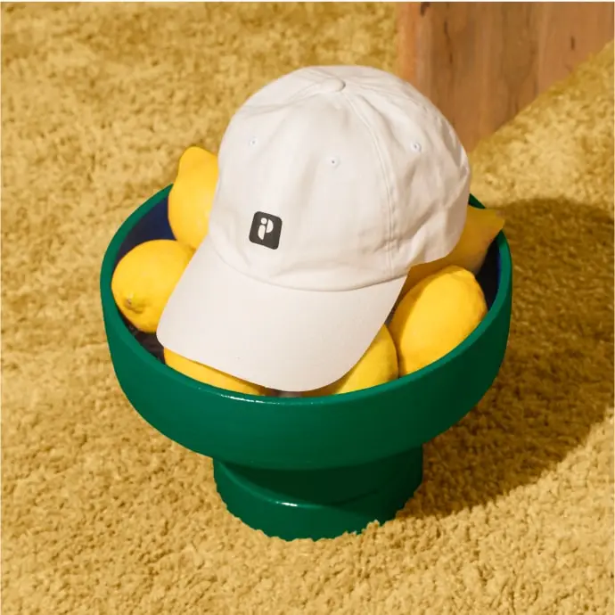
To maintain Datamolino’s brand recognition, we refreshed the existing color palette by introducing deeper and brighter shades, giving the brand a more lively feel. When selecting the colors, we made sure that the combinations and contrasts enhance text readability and accessibility for all users.

Typography
For the main typeface, we chose Poppins, a free Google Font, for practical and functional reasons. Poppins is a versatile, modern, and highly legible font, offering a wide range of weights and styles, making it a flexible choice for building a strong and consistent visual identity. Designed with accessibility in mind, it ensures readability across all platforms.


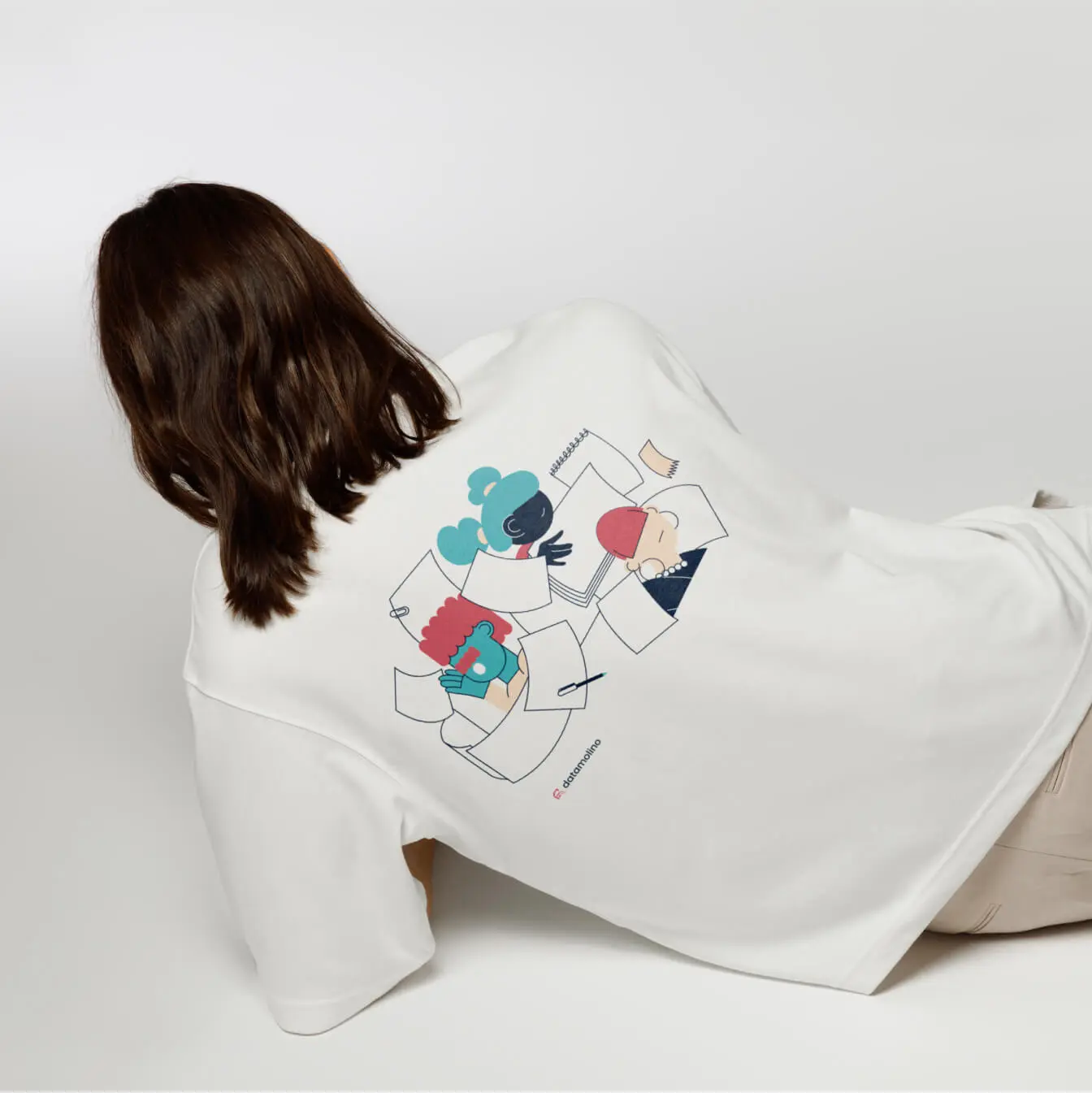
Illustration style
For the Datamolino brand, we incorporated custom illustrations as a key visual element to define its identity. We crafted a unique set of hand-drawn illustrations and pictograms, creating a cohesive library designed to unify and enhance the website’s visual language.
Our goal was to accurately reflect Datamolino’s industry—accounting—while capturing the essence of the brand. We ensured that the illustration style not only resonates with the target audience but also effectively communicates the product and its benefits.
Brand applications
In redesigning Datamolino’s brand identity, we focused on its practical applications and how the team would continue using it across various touchpoints. Our goal was to create a flexible, adaptable identity that works across a wide range of use cases.
Illustrations are used based on context. For more playful applications—such as landing pages, merchandise, or social media—custom illustrations add personality and lightness to the brand. At the same time, the brand allows for a more toned-down, minimalistic look for formal materials like sales decks or whitepapers. This versatility ensures that Datamolino remains recognizable and consistent, regardless of how or where the brand is applied.
Brand guidelines
As part of the brand redesign, we delivered a comprehensive brand guidelines document outlining key aspects of the new visual identity. This includes the color palette, typography, logo usage, imagery, illustration style, and tone of voice guidelines. These guidelines serve as a clear reference for both the in-house team and external partners, ensuring that the brand is consistently applied across all touchpoints.


Phase four
Creating website wireframes
Simultaneously, we began drafting the initial wireframes for the new website, focusing on content layout, functionality, and information flow—without incorporating design elements yet. We developed modular website components that adapt to various content needs and usage contexts, ensuring consistency across different sections.
Compared to the previous layout, we introduced a clearer hierarchy for subpages and modules, improving navigation and user experience. At this stage, we also started drafting the preliminary web copy. Through iterative feedback rounds with the team, we fine-tuned the wireframes, getting them ready for the website’s visual and technical development.
Phase five
Messaging and copywriting
In this phase, we focused on crafting clear, compelling copy that effectively communicates Datamolino’s value propositions, makes key information easily accessible, and is optimized for search engines.
In many instances, we only refined the existing content—simplifying text, crafting catchier headlines, and improving structure for better flow. The tone of voice was shaped to reflect Datamolino’s brand personality: simple, straightforward, no-fluff, yet friendly and helpful. Through several feedback rounds, we fine-tuned the messaging to ensure clarity, impact, and resonance.


Phase six
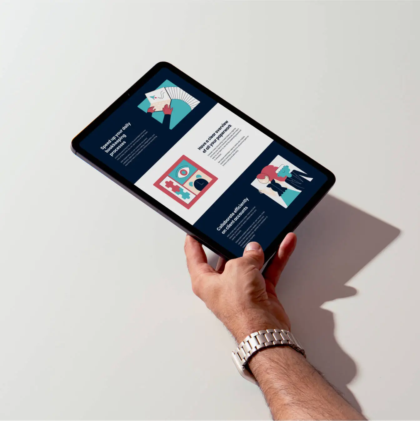
Web design
Time to bring the wireframes to life with design. We developed a web design system to ensure all visual components follow a clear hierarchy. The system includes a comprehensive typography library for consistency and readability, vector illustrations, and defined headline, color, and padding hierarchies, streamlining development and implementation.
Both desktop and mobile versions were designed and optimized for flawless responsiveness across all devices. The final design is clean, human-centric, and approachable, creating a welcoming experience for visitors.
Phase seven

Implementation
The final stage of the project was turning the approved web design into a fully functional website. We developed the website on WordPress, featuring a custom-coded visual editor with an intuitive user interface, allowing the Datamolino team to easily edit content and create new landing pages.
Each section was uniquely styled and optimized for fast loading and peak performance. We strictly adhered to the design specifications, ensuring a 1:1 match with the original design in Figma. Finally, we conducted comprehensive website optimization, including technical SEO, to ensure a fully responsive and properly configured environment.
Next steps
They say a website is never truly finished, which is why we provide ongoing support to the Datamolino team, managing additional edits and creating new landing pages or additional marketing and branding assets.
Client: Datamolino
Visual identity: Tamara Shawkatova
Illustration: Katka Schwarz
Content: Katy Mrvová
Web development: Martin Križo
Brand sprint workshop
Visual identity
Brand guidelines
Illustration & pictogram library
Brand & communication assets
Web design
Motion design
Web development
Copywriting
Event marketing materials
Speaking Heroes
Case study
Behind Speaking Heroes is a team of moderators and facilitators who run public speaking workshops where people learn to become more confident speakers, skilled at delivering engaging and memorable presentations or speeches.
The team approached us to create a strong visual identity and design and develop their new website. Our goal was to capture the energy of their courses in their visual communication. We focused on making the brand versatile and easy to use, making sure it could be easily applied across social media, presentation slides, merch, and other brand assets.
Brand identity creation
Speaking Heroes is all about confidence, skill, and—for many—stepping out of their comfort zone. We wanted to translate these emotions into the brand itself. It needed to be a little bold but very professional. Approachable and playful, while maintaining a high level of clarity and functionality.
Logo
The Speaking Heroes logo is the brand’s main identifier, designed for use across nearly all brand applications. It consists of a brandmark and logotype, with the logotype set in Archivo, the primary brand typeface. The brandmark is inspired by a speech bubble, symbolizing communication, dialogue, and the friendly, interactive atmosphere of Speaking Heroes’ workshops. The logo was designed to ensure high legibility, even at smaller sizes, making it effective across both digital and print materials.

Typography
We chose Archivo as the primary typeface for Speaking Heroes. This Google Font features a clean, geometric structure and is modern, versatile, and highly legible. It was also a practical choice–this font is widely accessible, easy to implement, and ensures consistency across all digital and print brand communications.

Color palette
Keeping in mind what Speaking Heroes stands for, we selected a bold neon yellow as the primary color. This bold choice symbolizes the confidence participants gain through the workshops. When paired with secondary gray tones, the neon yellow becomes even more vivid, creating a strong contrast that reinforces the brand’s positivity and energy.


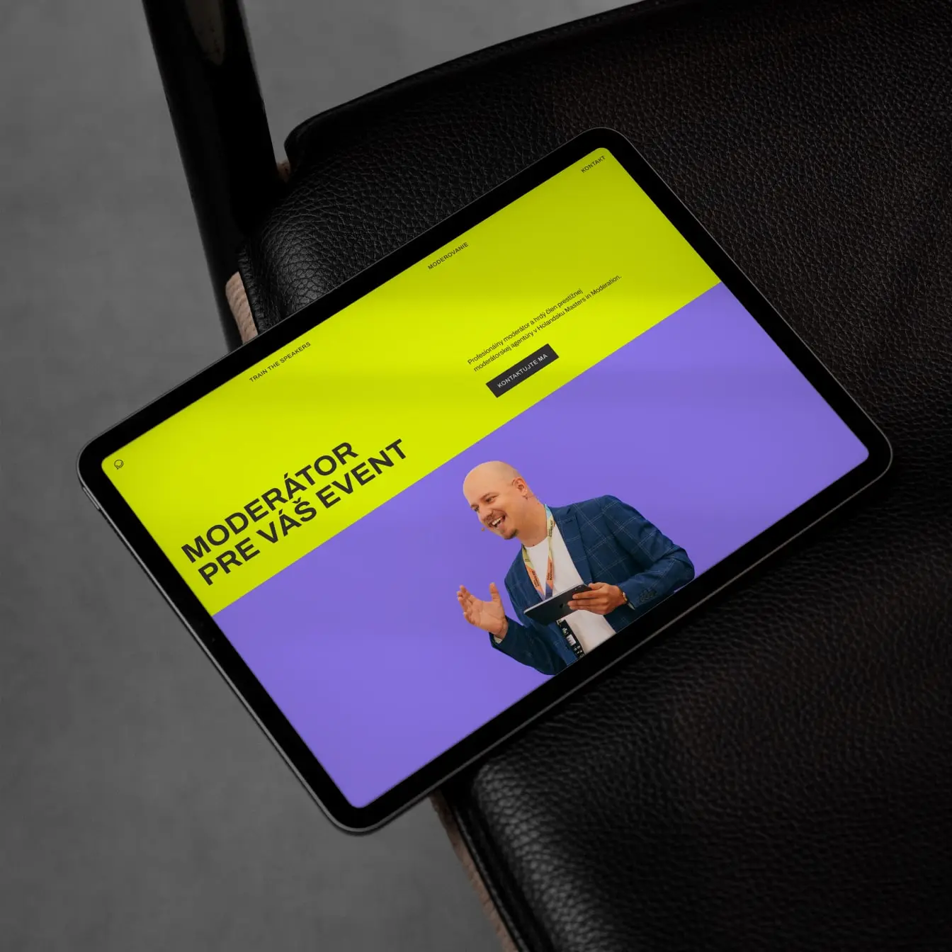
Web design
When designing the Speaking Heroes website, we aimed to balance bold, eye-catching elements with a structured layout, ensuring users can easily find the information they need while maintaining strong visual elements that reflect the branding. A key aspect of the design is the authentic imagery, featuring real photos from past sessions, bringing the workshop experience to life. It's an intuitive, well-structured website that provides just enough information to engage visitors while making course registration effortless.
Implementation
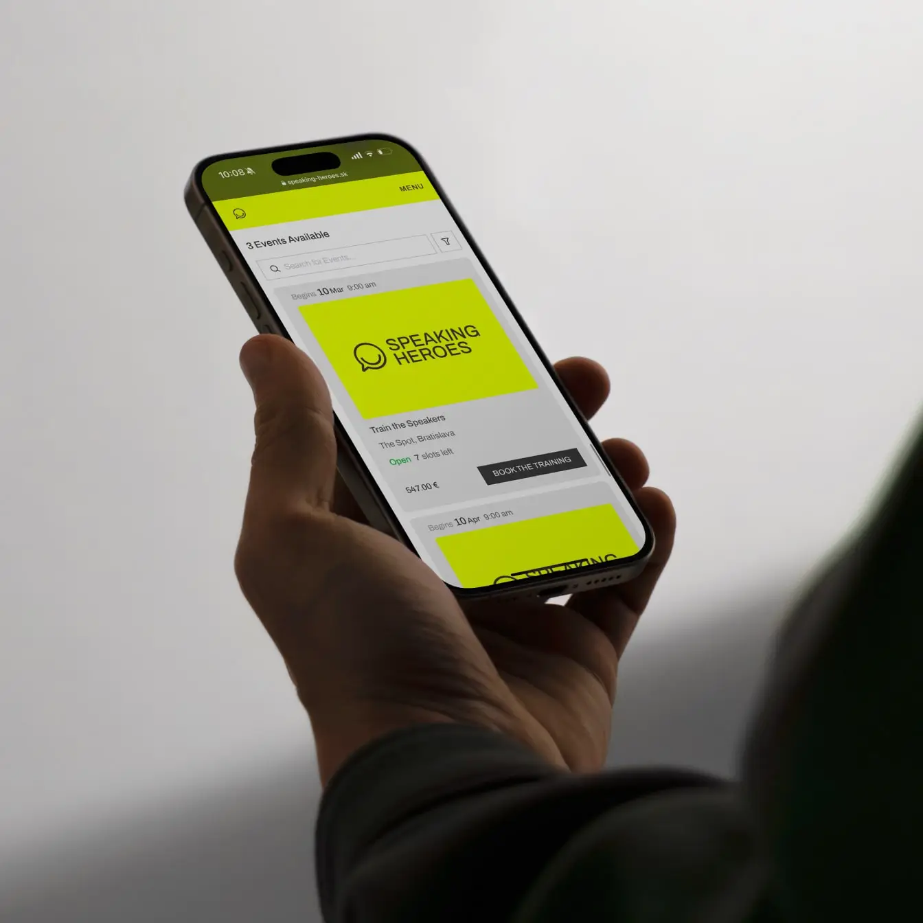
Following the brand identity creation and web design, we were also brought on to handle the implementation of the website. We developed it on WordPress, creating a custom WP template with easily editable web modules.
Additionally, we integrated the site with an online reservation system, a payment gateway, and email marketing software, allowing the Speaking Heroes team to efficiently manage their courses while maintaining seamless communication with participants.

Applications
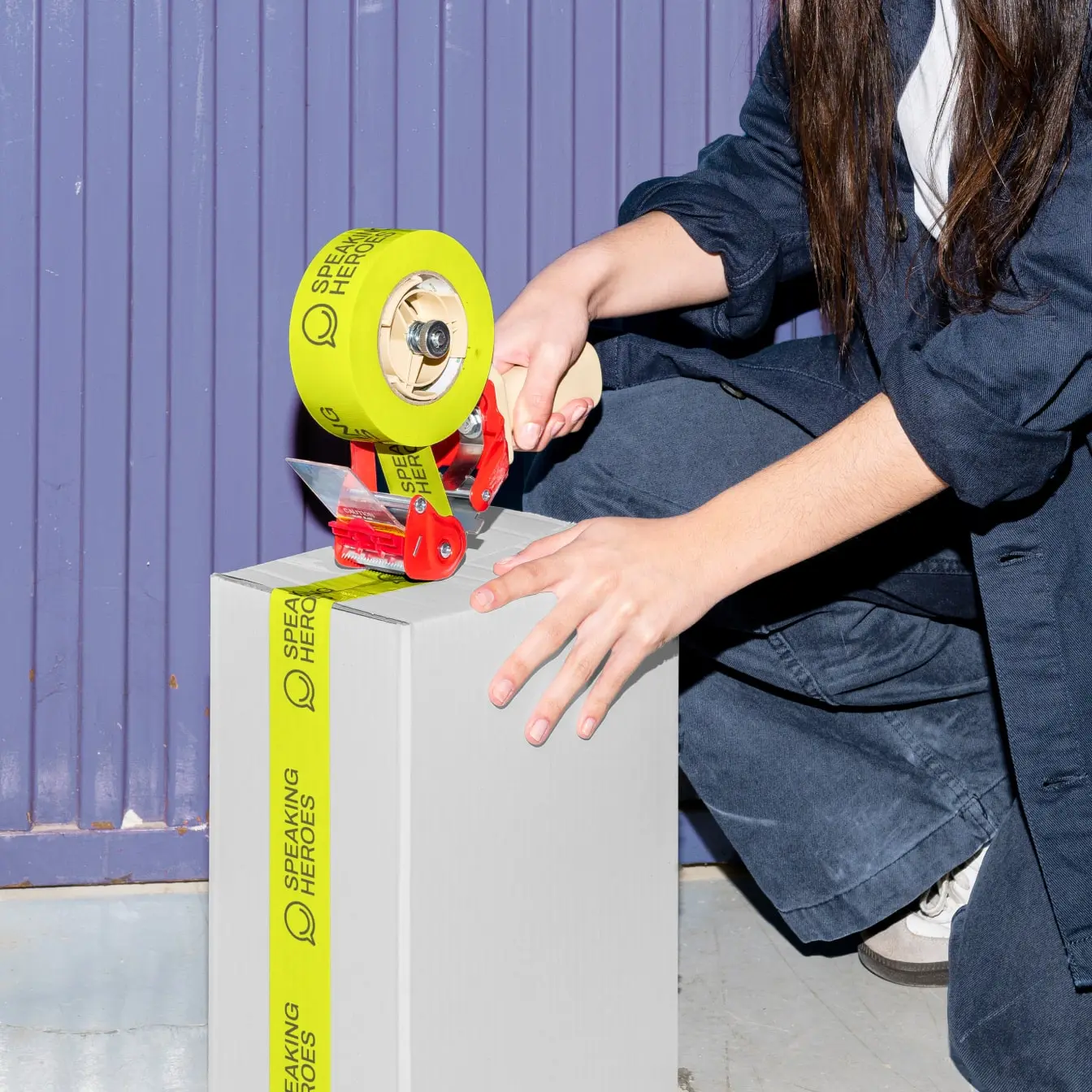
The result is a cohesive and impactful brand that empowers Speaking Heroes to inspire confidence in their audience while maintaining clarity and usability across all touchpoints.
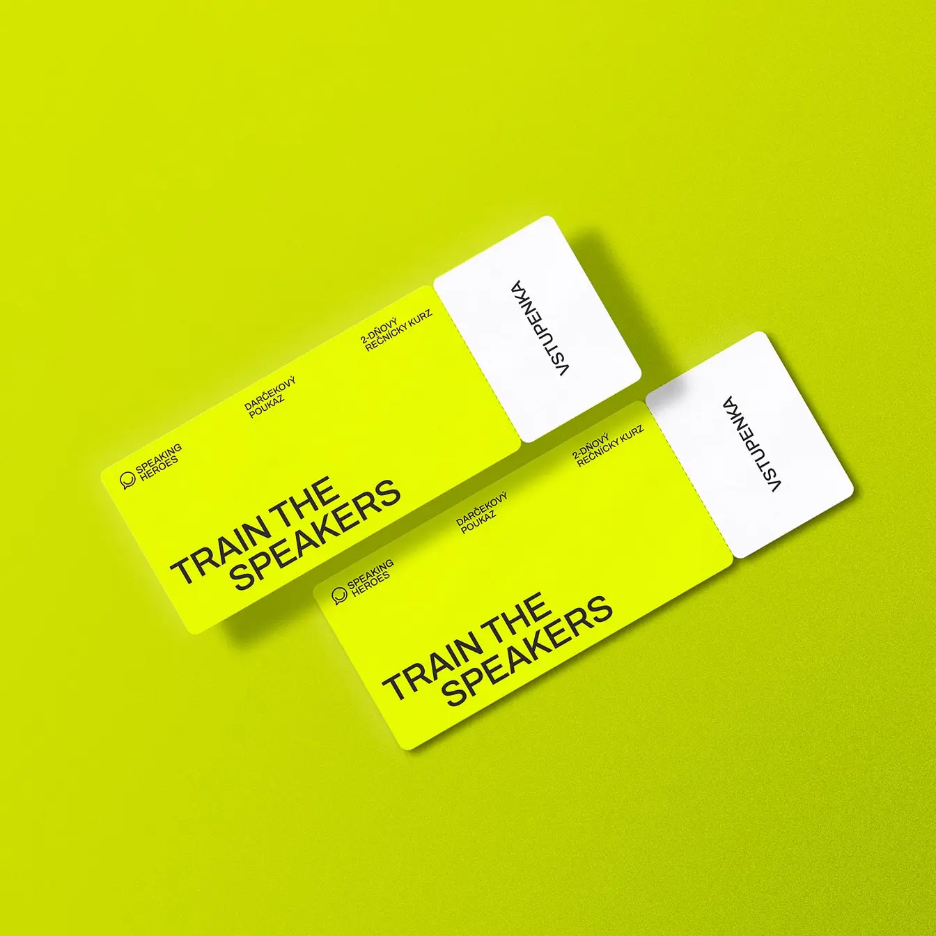
Vouchers
Social media
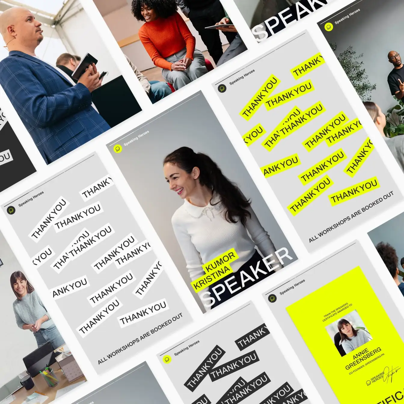
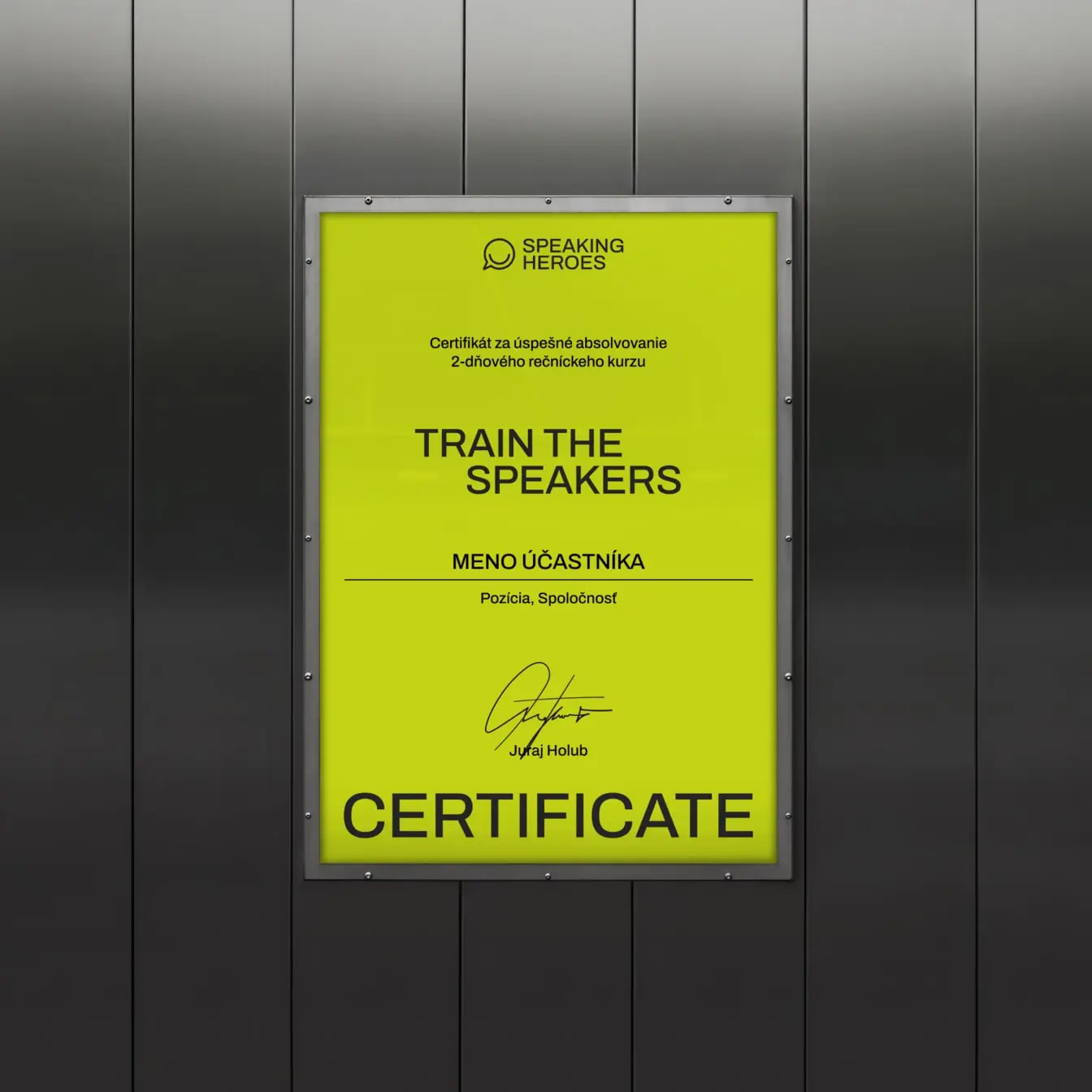
Certificates

Client: Speaking Heroes
Visual identity: Tamara Shawkatova
Web design: Tamara Shawkatova
Web development & app integrations: Martin Križo
Logo & visual identity
Brand guidelines
Brand & communication assets
Merchandise
Web design
Web development
App integrations
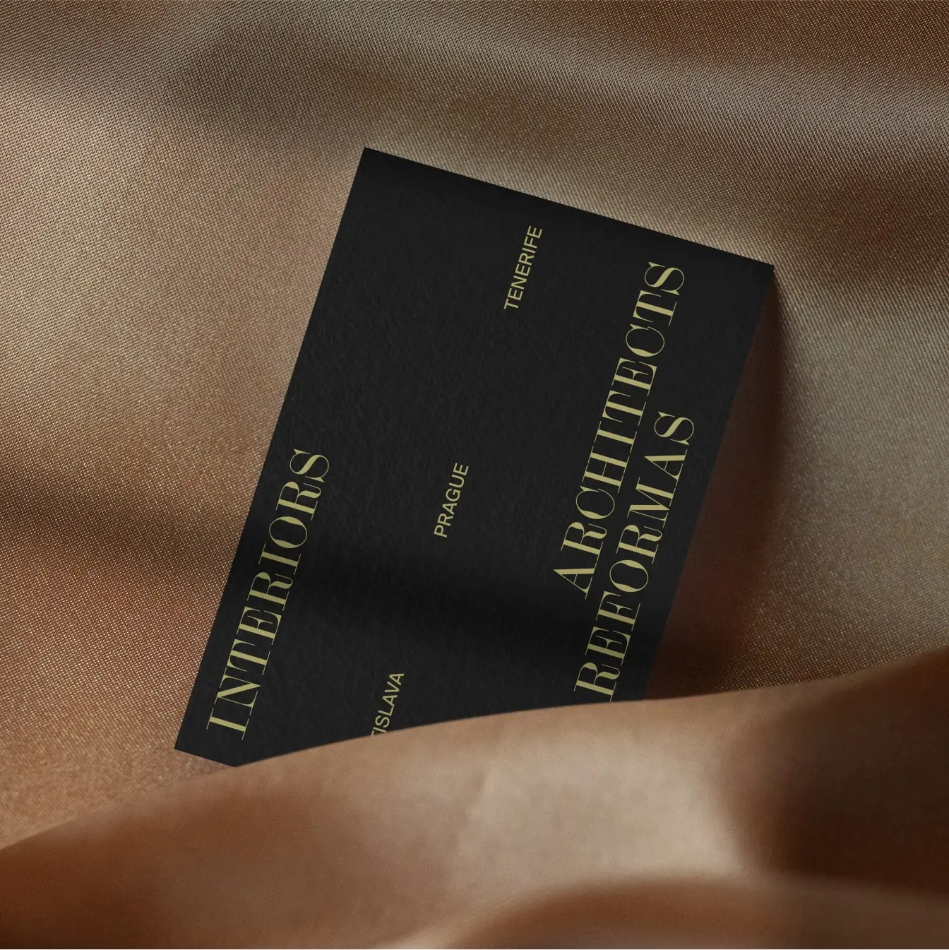
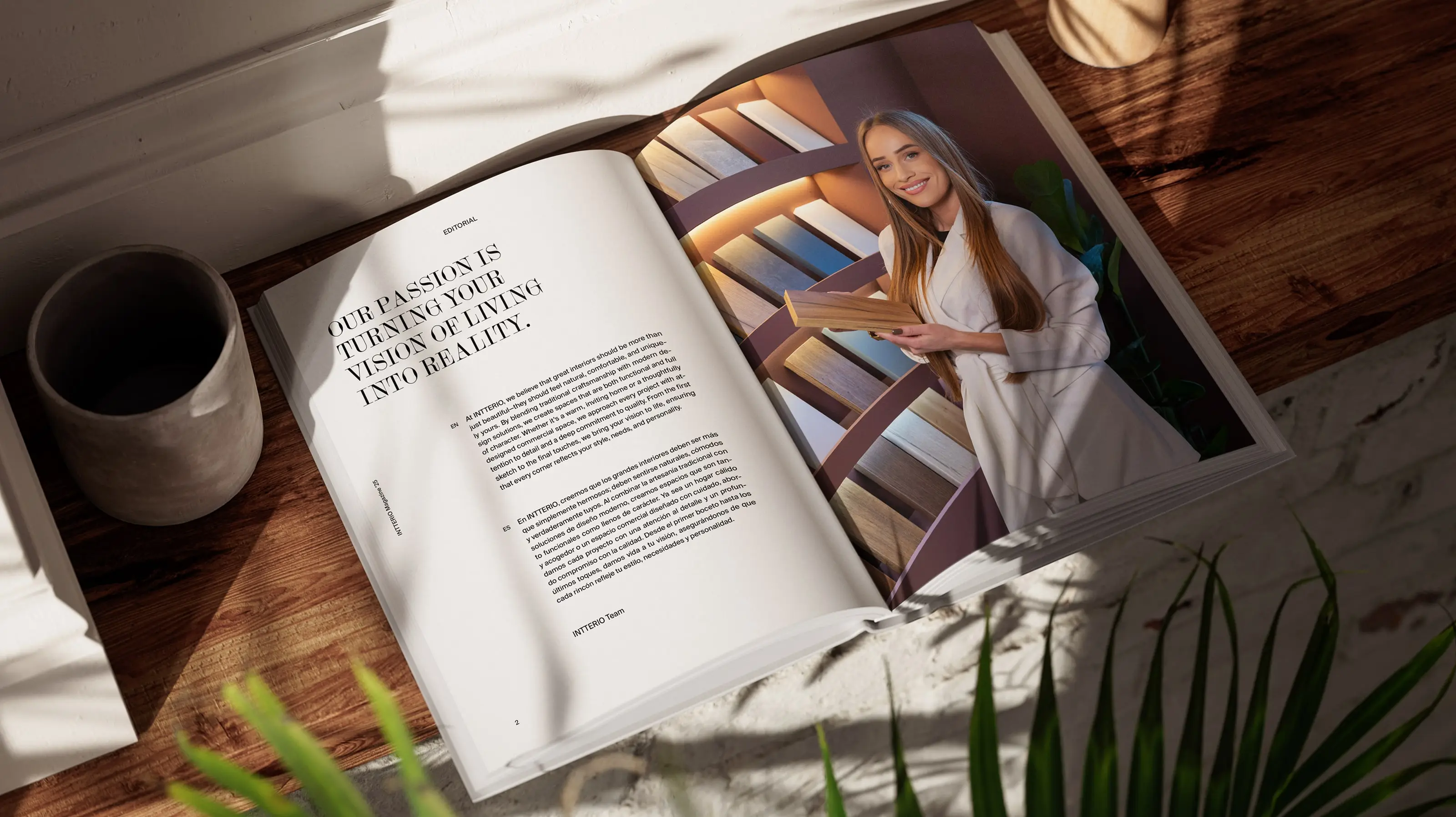
Intterio
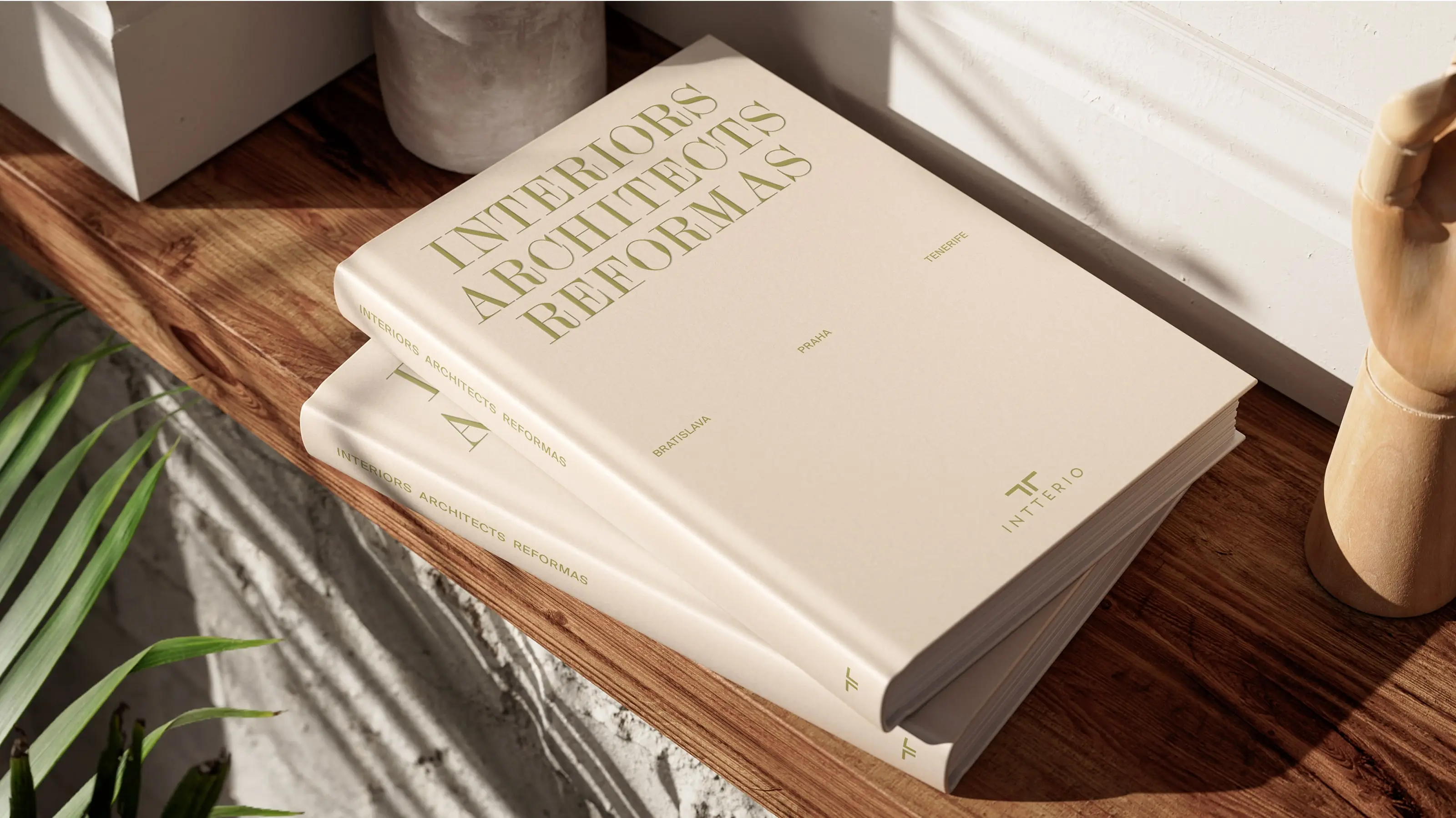
Catalogue
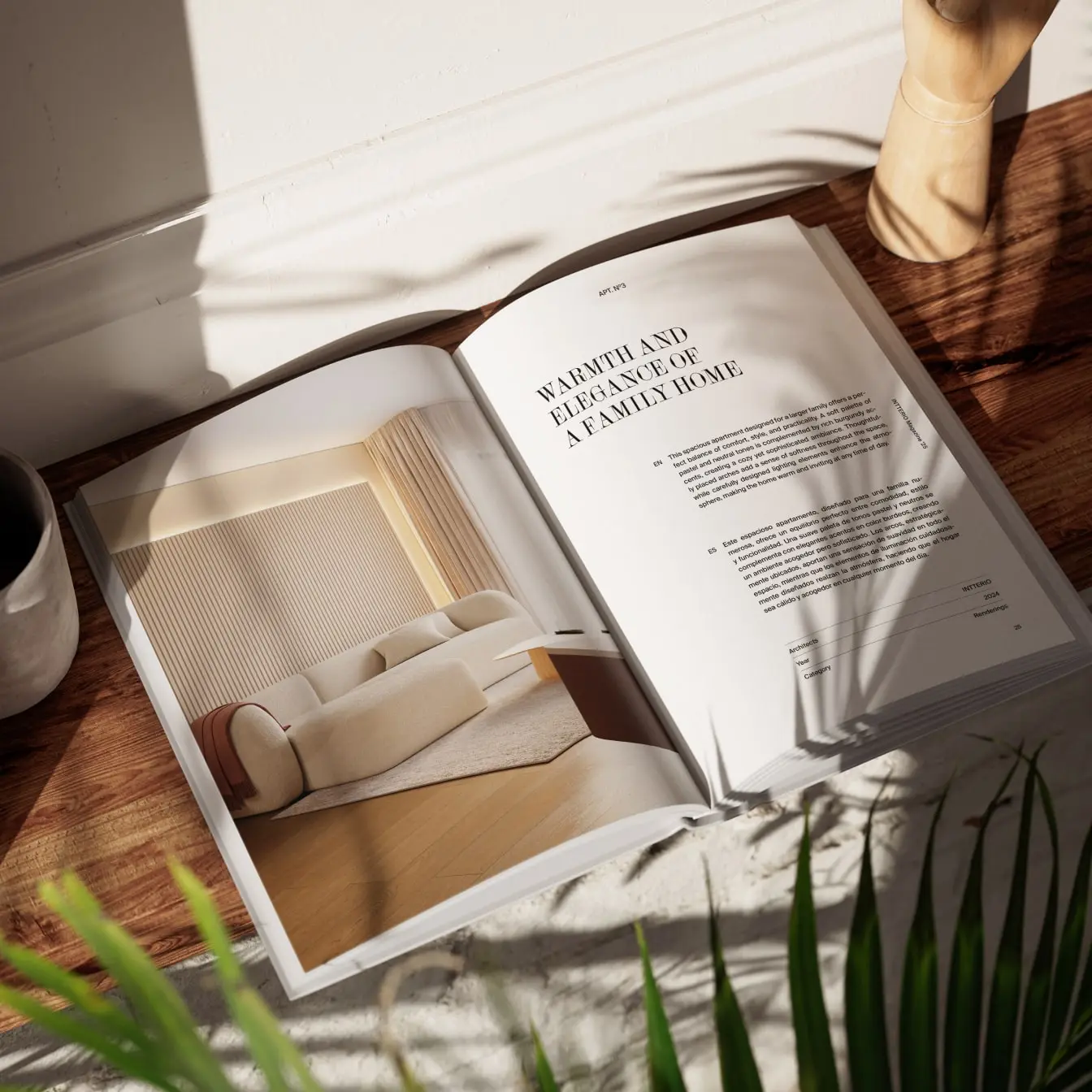
Intterio is a family-owned interior design and furniture company with in-house production, focused on delivering exclusive, high-quality solutions for both residential and commercial spaces. At the heart of Intterio’s work is the blend of traditional craftsmanship and modern aesthetics.
When we were approached to create their 2025 catalogue, the brief was clear: deliver a 130+ page bilingual magazine with a nearly impossible deadline. We had less than two weeks to complete and prepare the entire publication for print. With multiple clients on our desks and a hard print deadline looming, we took the challenge. And delivered.
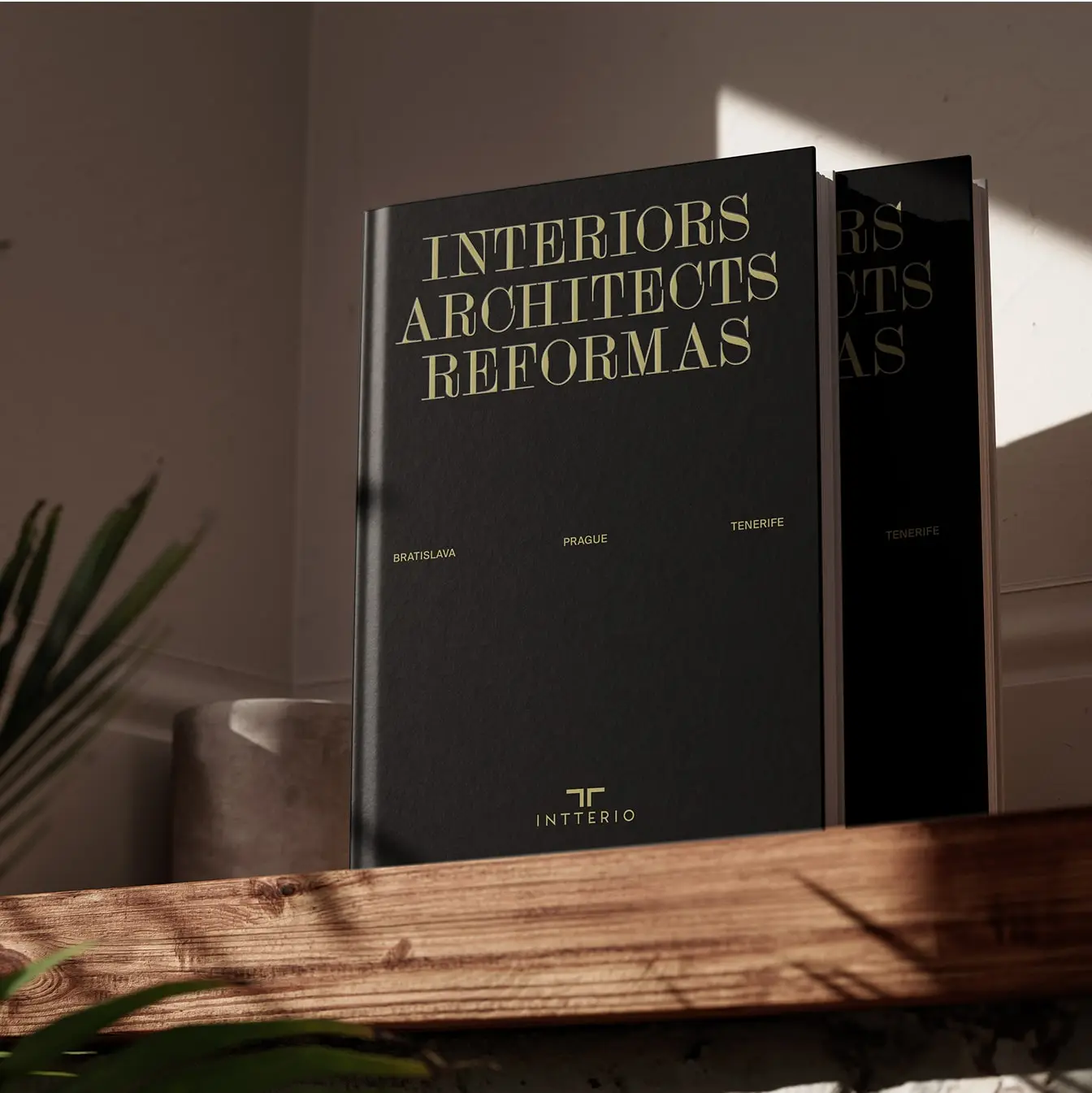
Editorial design
The editorial design is inspired by the mood, materials, and craftsmanship of the interiors created by Intterio. The result is a catalogue that feels both quietly luxurious and functionally clear.
White space, structure, and subtle details play a key role. The design doesn’t shout. It speaks with confidence. Each section was designed to elevate the high-quality photography and renders, allowing the interiors to take center stage, while text and layout served to frame and complement the work with elegance.
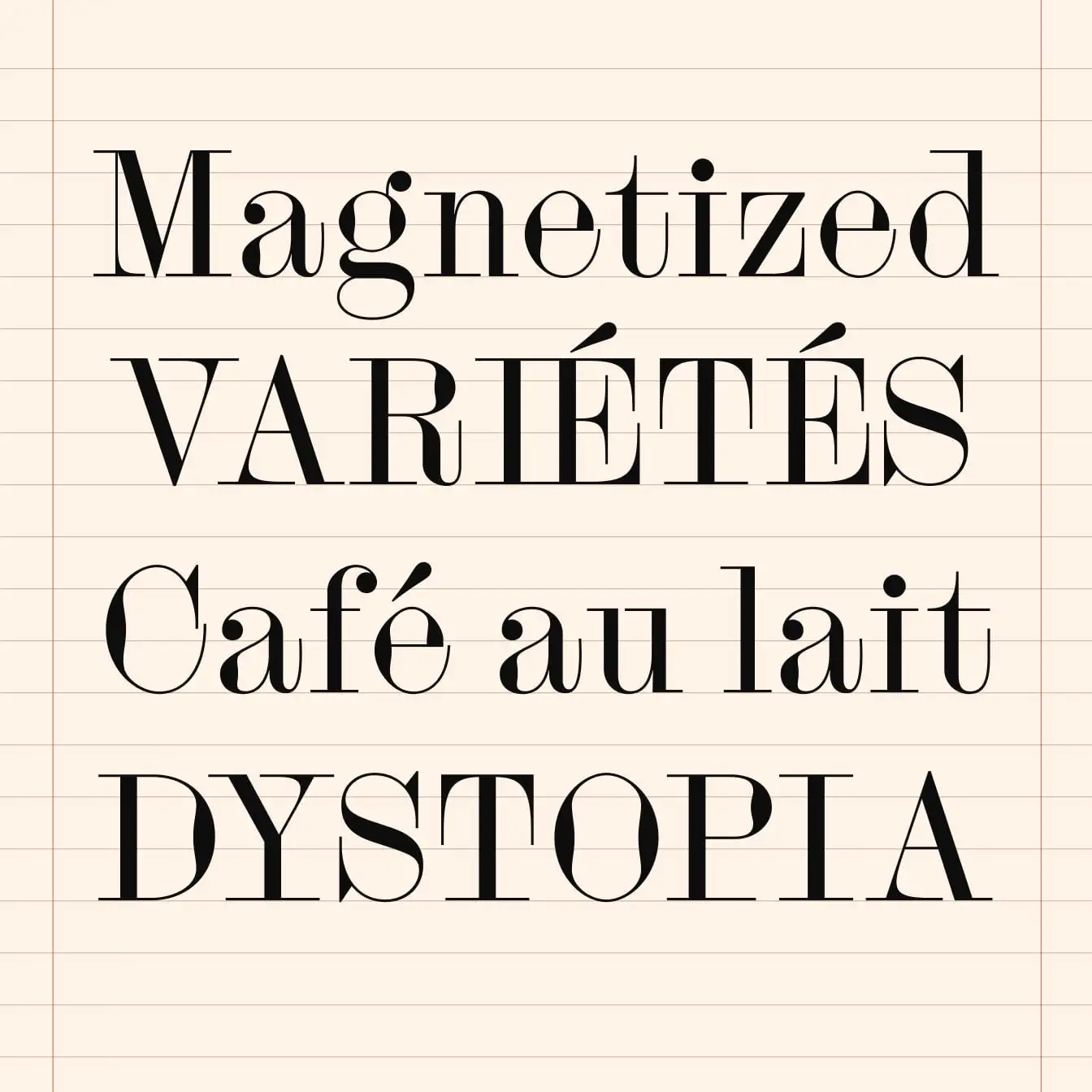
Typography
The magazine uses two carefully selected typefaces. For the display typeface, we selected Siluett, designed by Andree Paat (Kirjatehnika). Siluett’s sharp elegance and expressive forms add just the right amount of personality to headlines, helping us craft a premium feel without unnecessary ornamentation.
As for the text typeface, we went with Suisse Int’l, designed by Ian Party (Swiss Typefaces). Suisse Int’l, rooted in the tradition of the Swiss Style, brings clarity, structure, and neutrality to body text, captions, and navigation.
Siluett Regular
Kirjatehnika
Copywriting
The entire magazine is bilingual – written in English and Spanish, covering everything from editorial storytelling to apartment realizations descriptions, brand messaging, and microcopy across navigation and callouts.
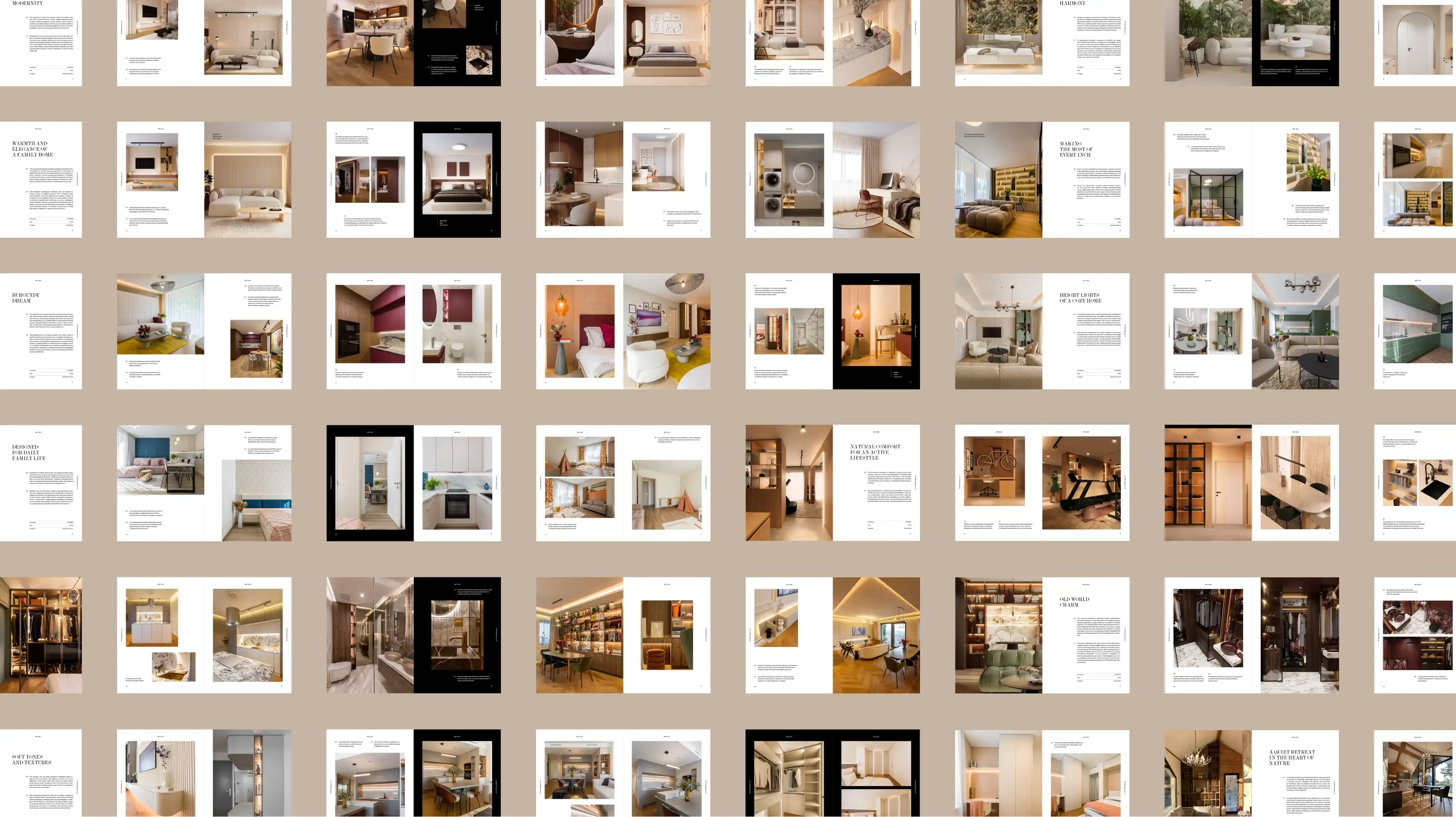
The text had to say a lot – in very little space. We created concise text for 13 apartments, each needing an individual voice – while still staying consistent with the Intterio brand tone. Headlines were crafted to evoke exclusivity without sounding pretentious. Descriptions blended lifestyle storytelling with architectural detail.
Layout
The layout is built on a precisely calculated invisible grid, derived from the width and height of each catalogue spread. Text follows a baseline grid, aligned to the same logic, ensuring typographic harmony across all pages.
The overall design is visual-first, with full-page photographs and 3D visualizations of interiors complemented by subtle, margin-based navigation and captions. The grid gave us the structure; the content brought it to life.
Client: Intterio
Art direction & editorial design: Tamara Shawkatová
Copywriting: Katy Mrvová
Typography: Siluett (Kirjatehnika), Suisse Int’l (Swiss Typefaces)
Cover design
Editorial design
Copywriting (EN/ES)
Print production support
Art direction
Publiq
Case study
Publiq is a community engagement app focused on the construction, energy, and local government sectors. It works like an interactive bulletin board where organizations share news, updates, and project progress – except residents and stakeholders can also respond, ask questions, participate in polls or surveys, and voice their concerns.
Our first interaction with Publiq started something like this: "We need a new logo. Can you help?" Fast forward a few months, we delivered not just a logo, but a complete visual identity, web design, and new brand messaging.
We kicked off the project with a brand sprint workshop, using targeted exercises to explore key aspects of the brand, including its core values, purpose, target audience, personality, and story. Over a three-hour session, we sat down with three of Publiq’s executives to define the brand’s unique positioning that would shape its visual identity, tone of voice, and copywriting direction. This session aligned all of us on expectations for the website redesign, laying a foundation for the next phases of the project.
Brand concepts
During the exploratory phase, we audited Publiq’s existing website and marketing materials, building on insights from the brand sprint. Using this foundation, we developed a brand concept that was later refined through collaborative discussions and feedback sessions.
Editorial design
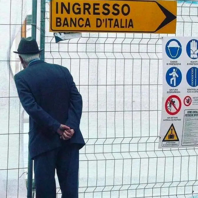
At the heart of the brand concept we created for Publiq is a simple idea: transformation should connect, not divide.
Like the umarelli — elderly men in Italy who watch over construction sites with genuine curiosity — we believe people want to understand what’s being built around them. Publiq embraces that curiosity and channels it into meaningful engagement. We saw an opportunity to turn this emotion into a brand built on the idea of turning barriers into bridges. The result is a visual identity that aligns with the company’s vision and feels authentic to the people behind Publiq.
Logo development
The logo development process involved exploring symbolism and distinctiveness, experimenting with different shapes, combinations, and weights to achieve the right balance between clarity, flexibility, and brand recognition.
The chosen visual identity features a distinctive logo icon used across brand and marketing assets and as the app icon. Inspired by the brand name, the icon resembles the letter “P” while symbolizing Publiq’s human-centric mission – connecting developers and local governments with residents.
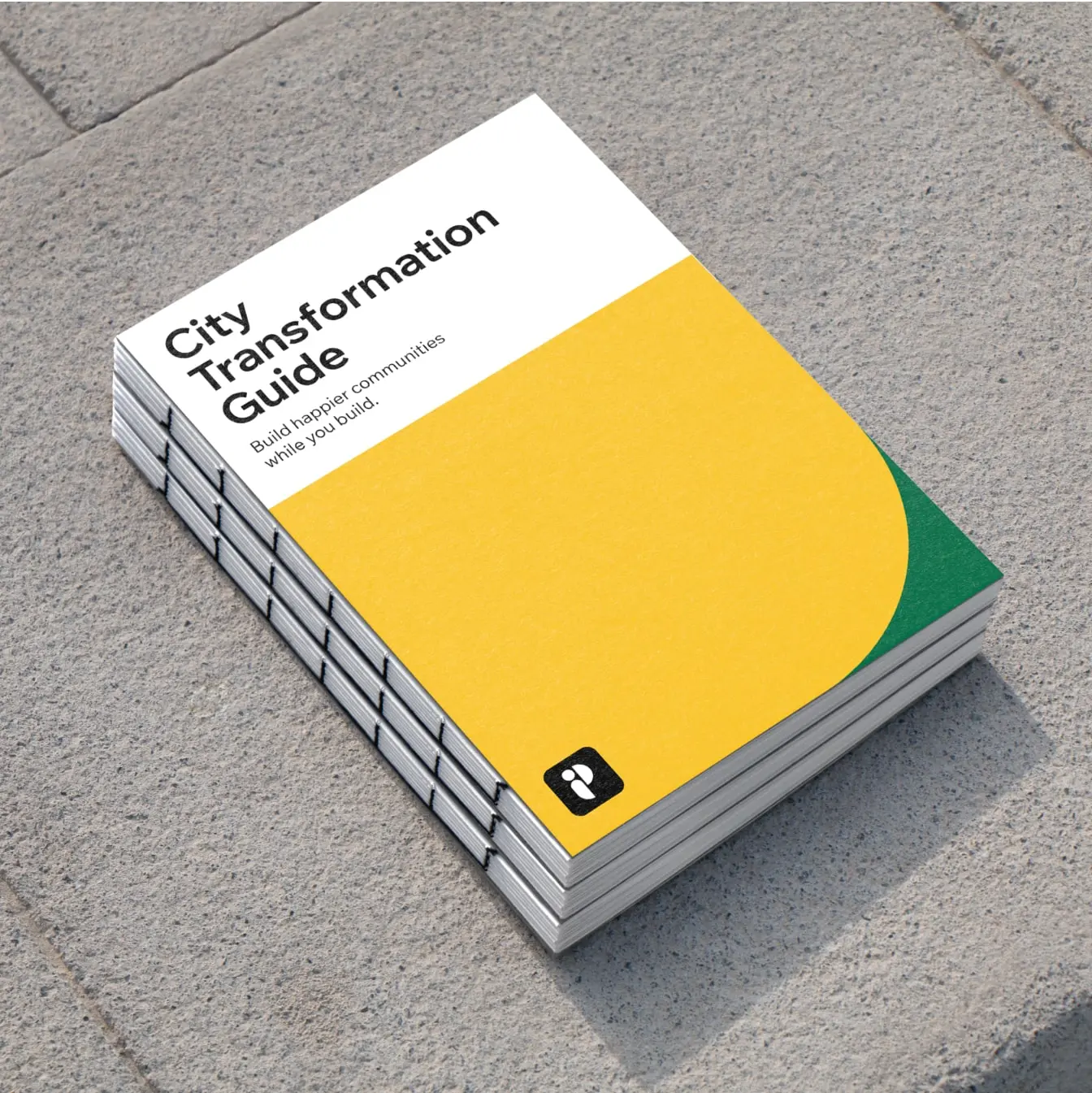
Brand guidelines
To ensure a consistent brand presence, we created for Publiq a comprehensive brand book – a document outlining all key aspects of the brand’s visual identity. The guidelines cover logo usage, color palette, typography, imagery, illustration style, and tone of voice, defining the foundation of Publiq’s visual communication.
Throughout the process, we carefully structured and refined these elements into a clear, practical guide that both Publiq’s internal team and external collaborators can rely on.


Color palette & typography
The color palette we chose for Publiq balances clarity and energy, with off black and white as the primary colors for text-heavy sections to ensure maximum readability. Vibrant accent colors — green, yellow, pink, and blue — are used in illustrations and text-free sections, keeping the design fresh and modular.
We picked Wix Madefor Display for bold, attention-grabbing headings and Wix Madefor Text for clear, readable body copy — modern Google Fonts suitable for a SaaS company.
Photography
For Publiq, we chose a photography style that captures real people and genuine moments in public spaces — reflecting the brand’s focus on community and engagement. We prioritized high-quality images with natural outdoor lighting, neutral tones, and subtle branding. Our goal was to showcase authenticity and simplicity, with a strong emphasis on diversity, inclusivity, and positive emotions.
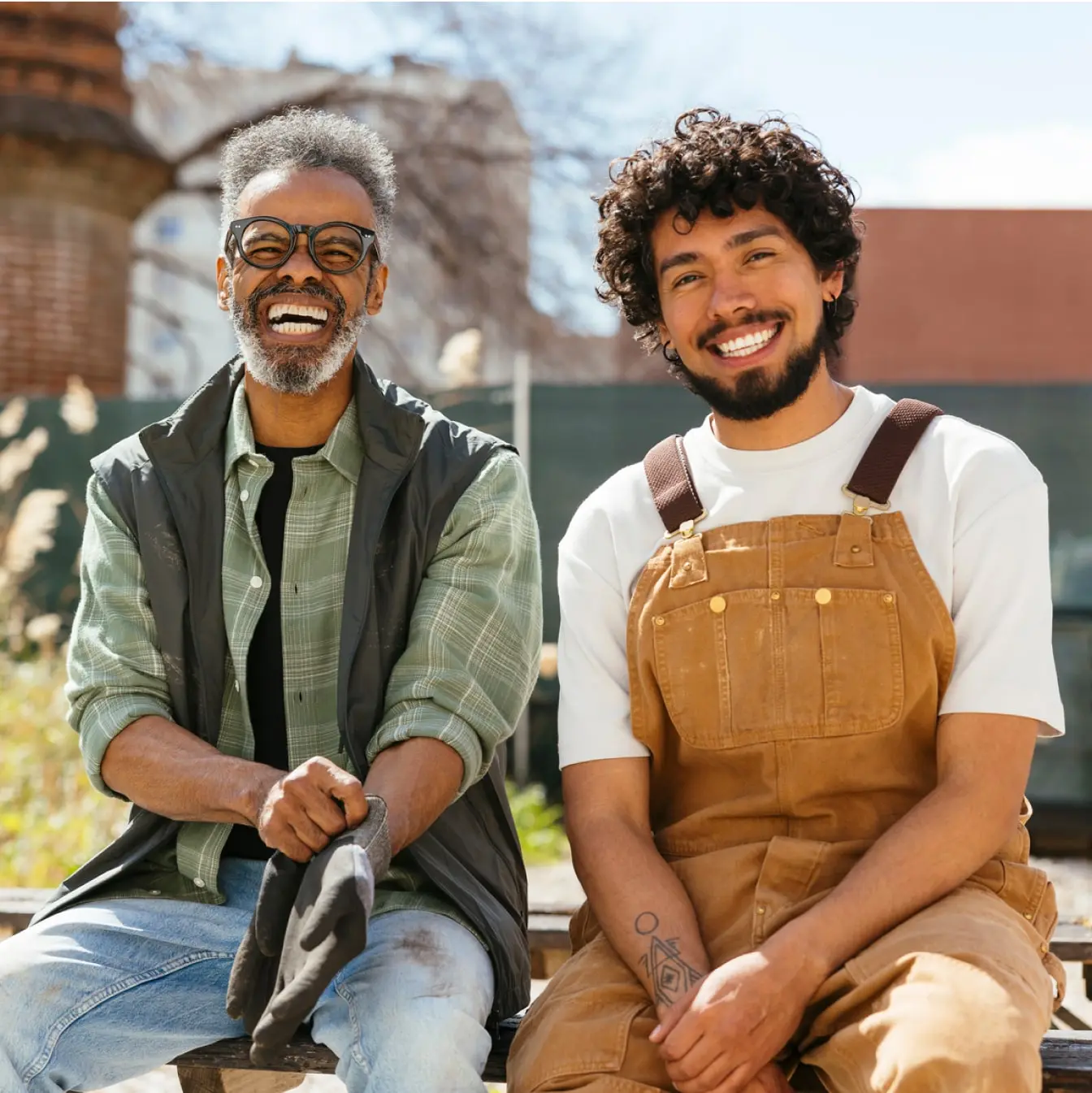

Illustration style
To visually communicate abstract concepts, we developed a custom vector illustration style for Publiq. These illustrations are simple and friendly, focusing on themes like residents in public spaces, construction sites, and other elements that reflect the dynamic life of communities. They serve as a playful yet practical tool to express ideas that are hard to capture in photos, evoke emotion, and help explain features or abstract concepts.
We use solid colors and negative space to create clean, modern visuals with a distinct personality. The color palette is intentionally limited to one brand color, complemented by black and white, to ensure consistency and strong brand recognition across all materials.
Brand messaging and tone of voice
We worked with Publiq’s team to refine their messaging, making sure it resonates with its diverse audience groups. Using the Jobs to be Done framework, we explored the unique problems and desires of each audience segment and crafted a set of clear, impactful messages.
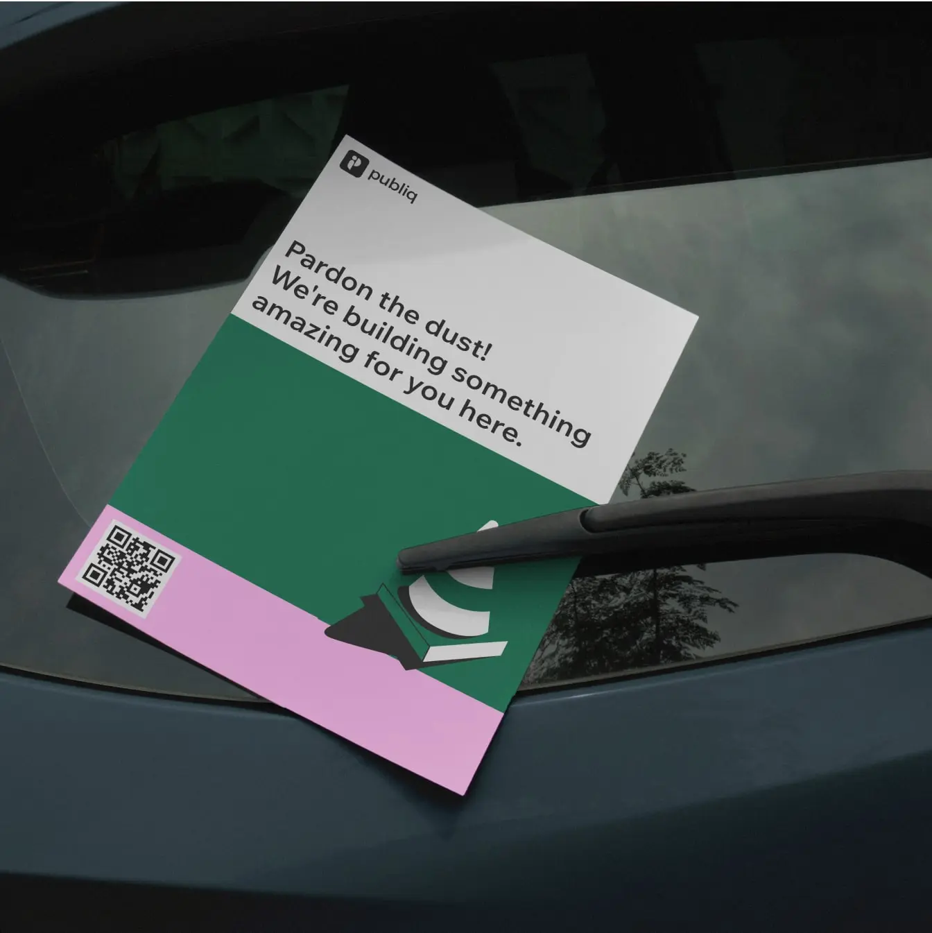
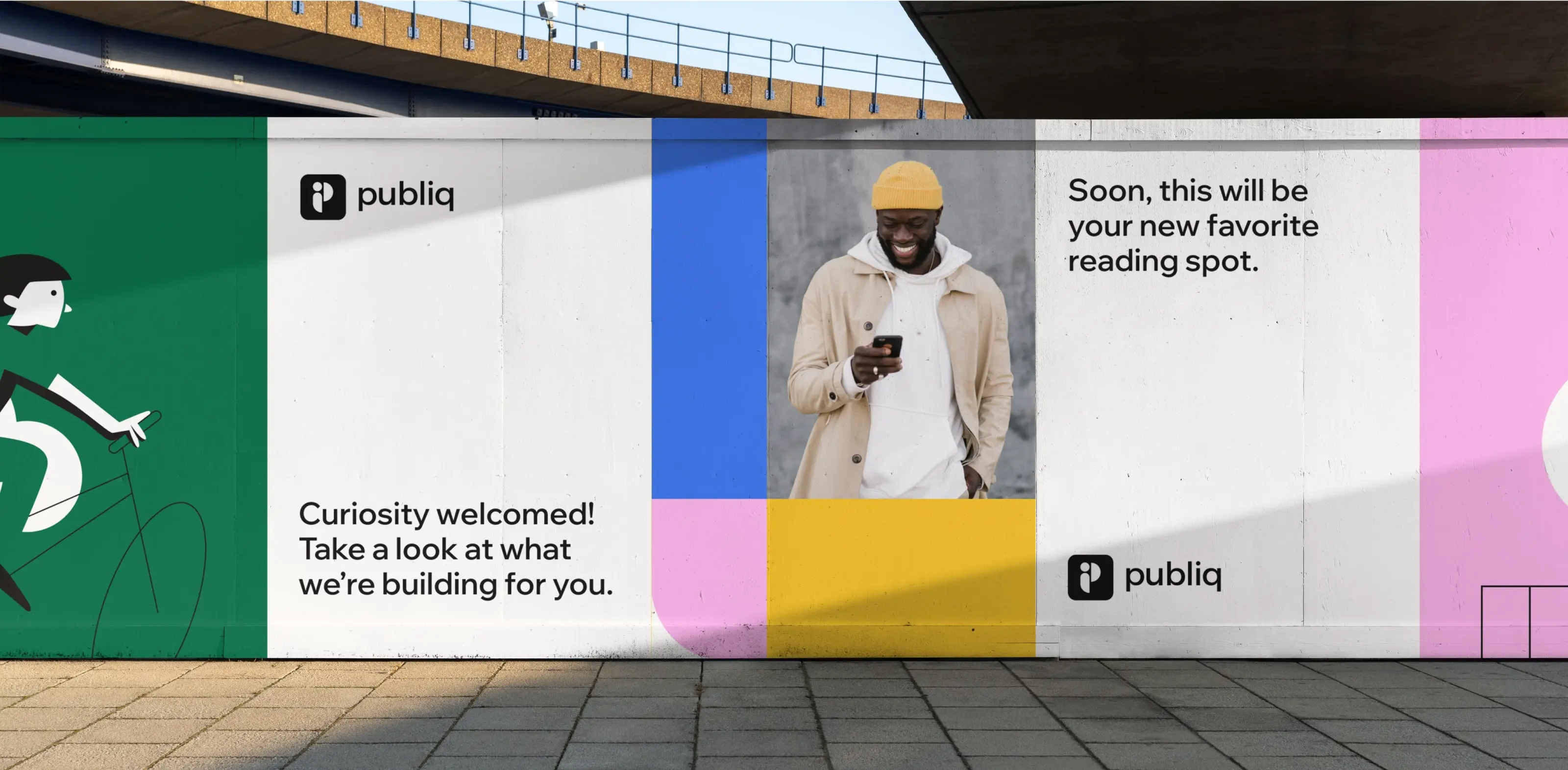
We defined Publiq’s product value propositions, which served as a foundation for the website copy and broader communication strategy, and came up with a set of more playful messaging style for lighter contexts – such as merch or out-of-home advertising.
During this process, we helped shape a distinct tone of voice that aligns with Publiq’s values and positioning. These resulted in the Voice & Tone guidelines – included in the Brand guidelines document.

Wireframing, content design & web copywriting
As part of this process, we defined modular website components that adapt to different content needs and usage contexts, ensuring consistency across the entire site. Compared to the company’s previous website, the new layout makes better use of space, improves information hierarchy, and enhances navigation and user experience.
We took extra care optimizing the placement of primary and secondary buttons, ensuring they align with the customer journey and sales funnel for a logical, user-friendly flow that guides visitors toward key actions.
We crafted the first copy drafts based on the messaging and tone of voice established earlier in the project. Through collaborative feedback rounds, we refined both the copy and wireframes, preparing them for the website’s visual and technical development.
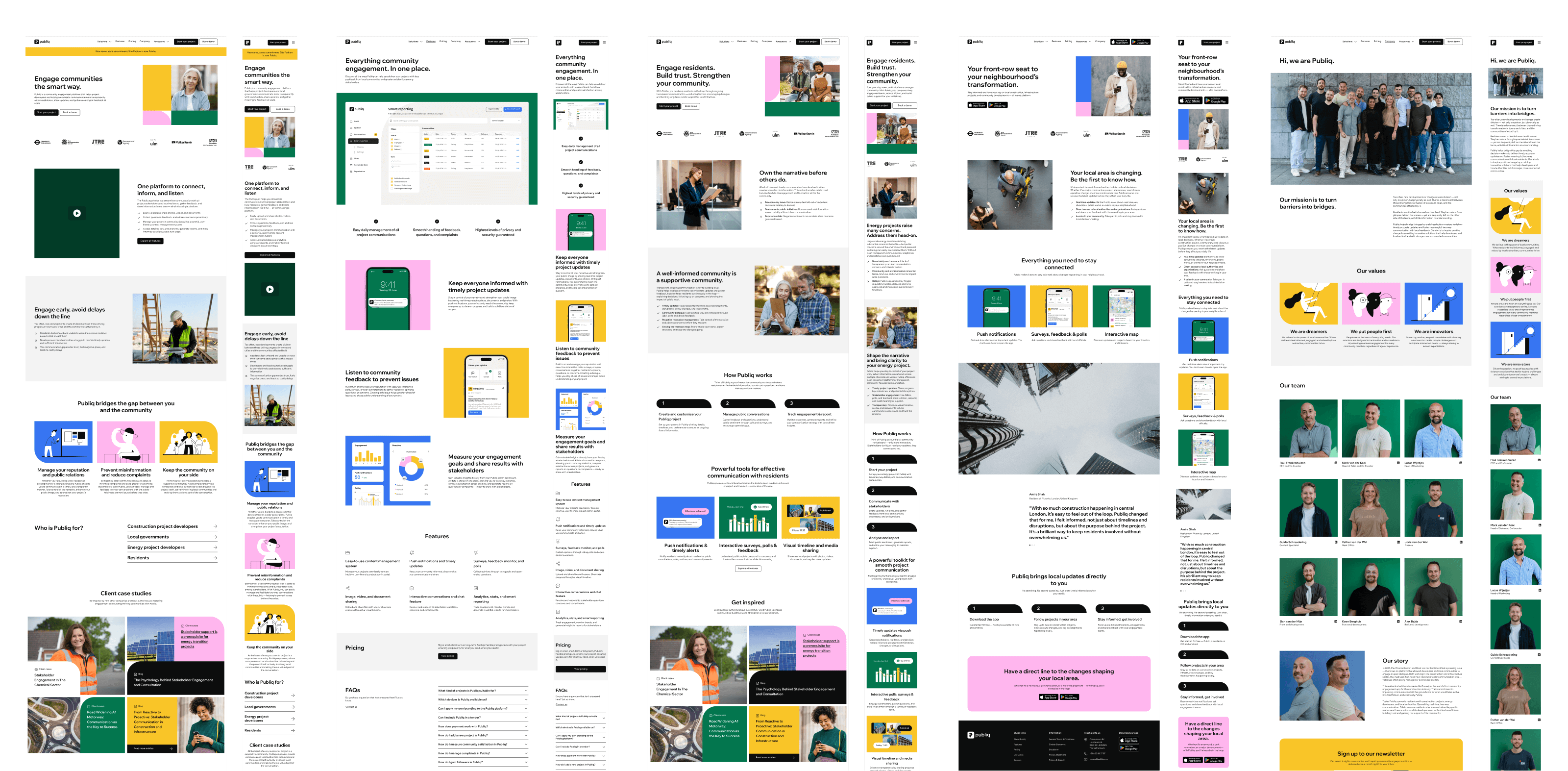
Web design
For Publiq, we designed a simple, clean, and highly functional website. It follows a logical structure, using an 8-point grid system for spacing and alignment. The white background allows for easy modular rearrangement and creation of new subpages. Buttons are kept black and white, with colors reserved for visuals. The design incorporates both photography and illustration, with a clear logic behind their use – each serving distinct purposes.
As part of the web design process, we created a web style guide and UI library to maintain consistency across the site and provide a flexible system for building new pages and components. As standard, we designed for both desktop and mobile to deliver a fully responsive experience across all devices. The result is a clean, structured, and easy-to-navigate website.


Client: Publiq
Visual identity: Tamara Shirin Shawkatová
Web design: Tamara Shirin Shawkatová
Copywriting: Katy Mrvová
Web development: SUM Digital
Logo & visual identity
Brand guidelines
Brand & communication assets
Web design
Copywriting & messaging