Datamolino
Case study
Datamolino is an invoice processing software company with over 10 years on the market. The team planned a complete redesign and custom development of their website, which hadn’t been updated in some time. They approached us to lead the project and update their brand identity along the way.
As the company’s key marketing asset, the website needed a refresh. Besides a visual update, Site Project also delivered improvements in web architecture, navigation, and brand messaging, ensuring it aligns more closely with Datamolino’s vision and growth.
Phase one
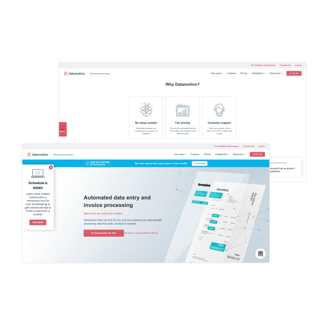
Initial discussions and website audit
We kicked off the project with a series of in-depth discussions with the Datamolino team to fully understand their objectives and expectations. We conducted an audit of the company’s existing visual communication and website, identifying key areas for improvement. The website had a somewhat cluttered appearance and lacked a clear visual language. We also uncovered some structural issues and inconsistencies in hierarchy and the use of web modules.

Phase two
Brand sprint workshop
As part of the prep phase, we conducted a half-day brand sprint workshop with Datamolino’s leadership team. The goal was to distill the essence of the brand and define the trajectory for its future brand strategy. Through structured exercises, we explored the company’s core values, unique selling points, and target audiences. The brand sprint played a crucial role in shaping the visual language, tone of voice, and copywriting direction, while also ensuring alignment on expectations for the website redesign.
Phase three
Exploration and creating stylescapes
Following the brand sprint, we initiated the exploratory phase, creating mood boards, experimenting with various concepts, gathering feedback, and ultimately conceptualizing Datamolino’s new brand identity.
Logotype refresh
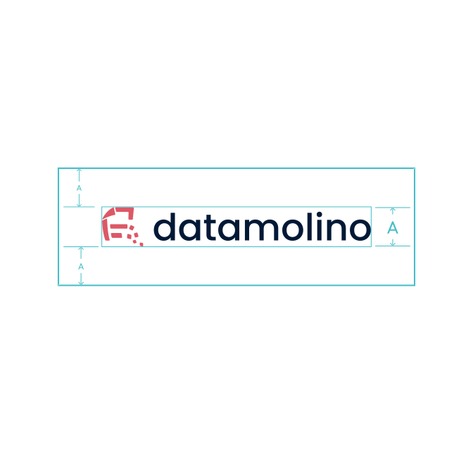
One of the specific requests on the client's side was to retain the original brandmark. With this in mind, we focused on refreshing the Datamolino logo while preserving its brand icon. We updated the logo’s font to match the typeface selected for the rest of the brand touchpoints, ensuring consistency and giving it a more modern, refined look.
Color palette
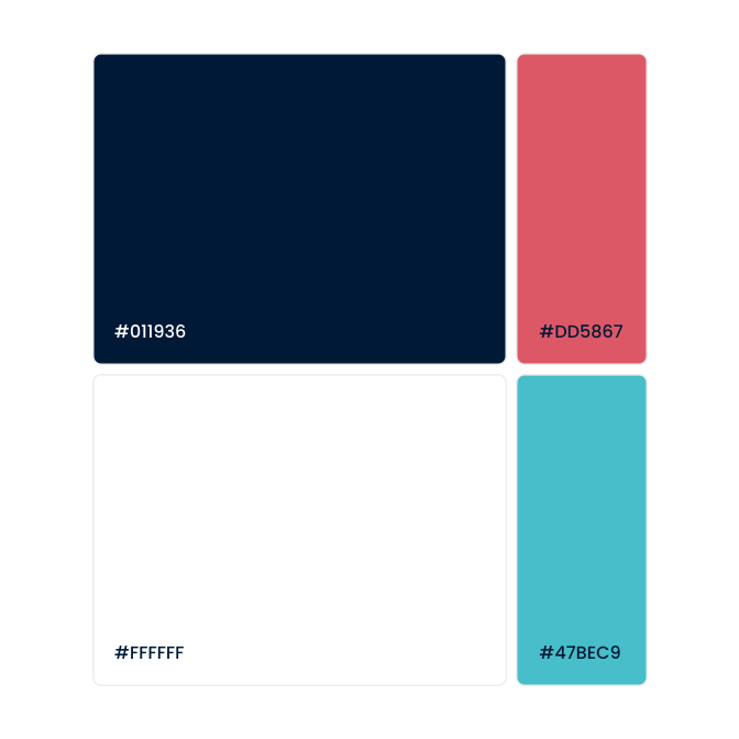
To maintain Datamolino’s brand recognition, we refreshed the existing color palette by introducing deeper and brighter shades, giving the brand a more lively feel. When selecting the colors, we made sure that the combinations and contrasts enhance text readability and accessibility for all users.
Typography
For the main typeface, we chose Poppins, a free Google Font, for practical and functional reasons. Poppins is a versatile, modern, and highly legible font, offering a wide range of weights and styles, making it a flexible choice for building a strong and consistent visual identity. Designed with accessibility in mind, it ensures readability across all platforms.
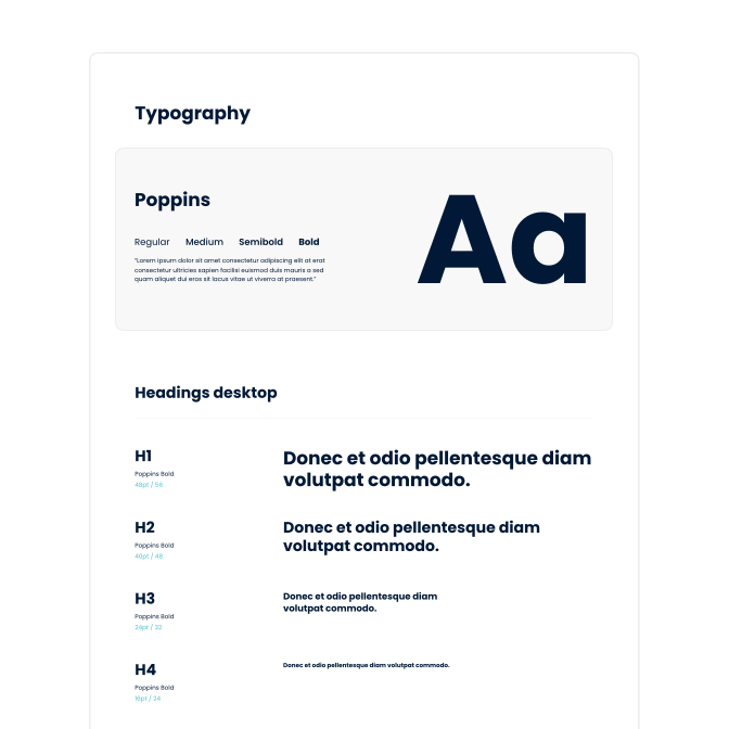

Illustration style
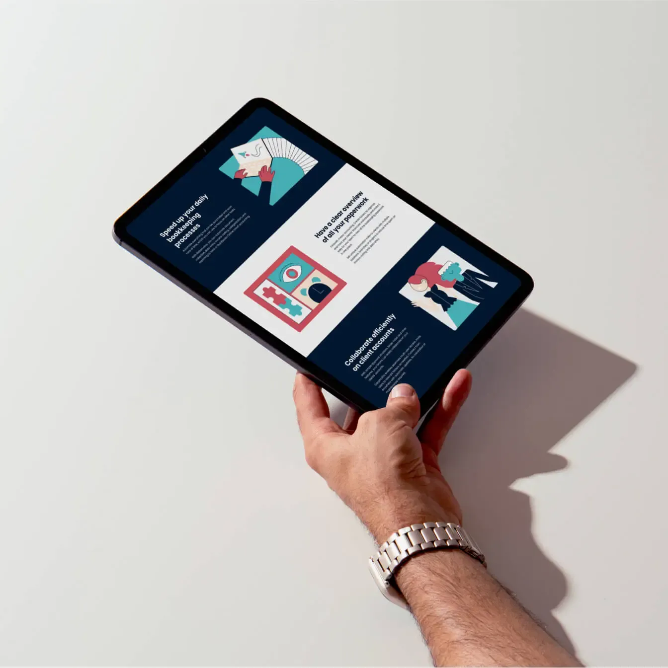
For the Datamolino brand, we incorporated custom illustrations as a key visual element to define its identity. We crafted a unique set of hand-drawn illustrations and pictograms, creating a cohesive library designed to unify and enhance the website’s visual language.
Our goal was to accurately reflect Datamolino’s industry—accounting—while capturing the essence of the brand. We ensured that the illustration style not only resonates with the target audience but also effectively communicates the product and its benefits.
Brand applications
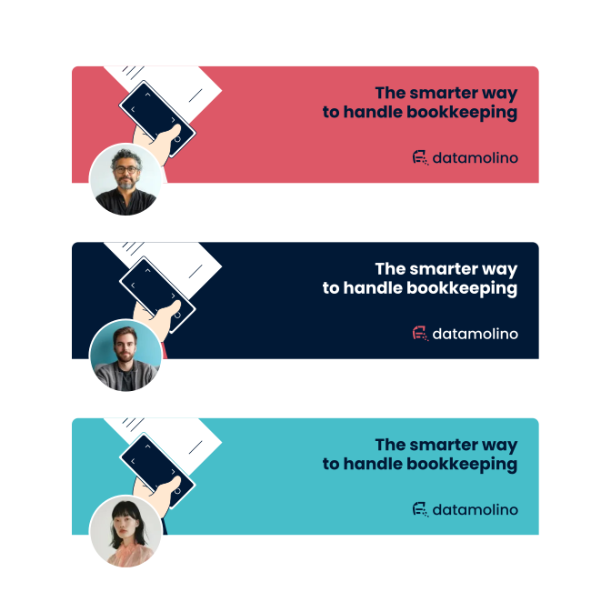
In redesigning Datamolino’s brand identity, we focused on its practical applications and how the team would continue using it across various touchpoints. Our goal was to create a flexible, adaptable identity that works across a wide range of use cases.
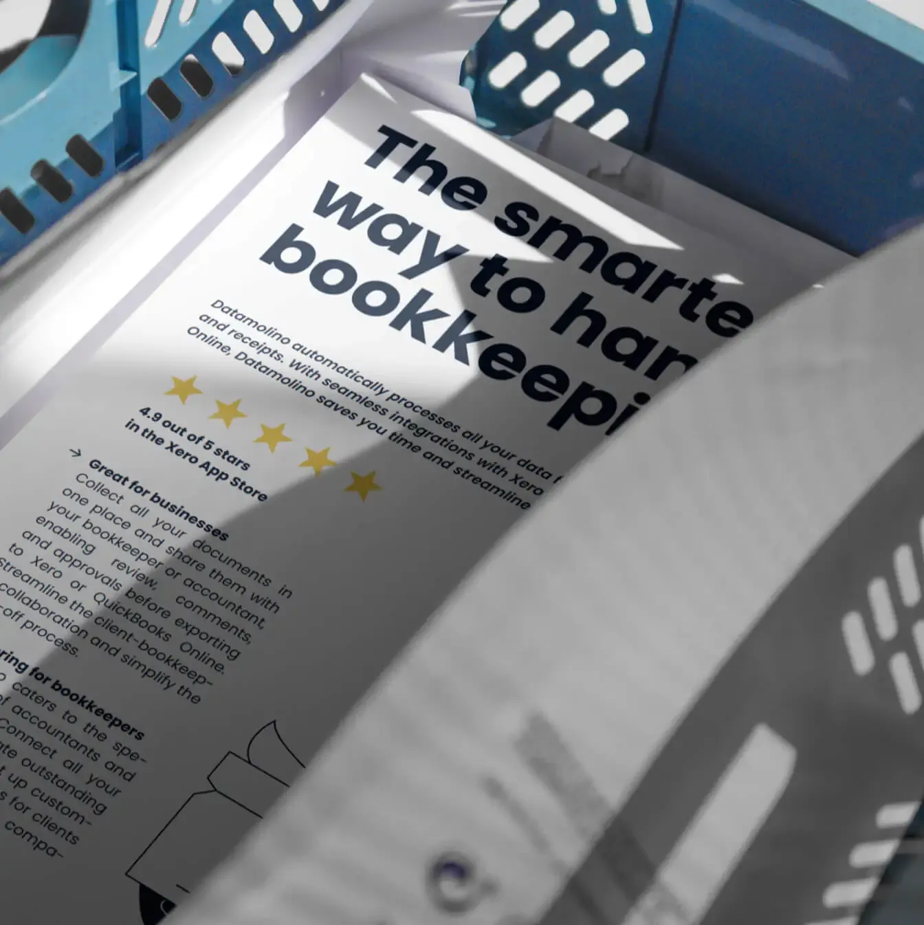
Illustrations are used based on context. For more playful applications—such as landing pages, merchandise, or social media—custom illustrations add personality and lightness to the brand. At the same time, the brand allows for a more toned-down, minimalistic look for formal materials like sales decks or whitepapers. This versatility ensures that Datamolino remains recognizable and consistent, regardless of how or where the brand is applied.

Brand guidelines
As part of the brand redesign, we delivered a comprehensive brand guidelines document outlining key aspects of the new visual identity. This includes the color palette, typography, logo usage, imagery, illustration style, and tone of voice guidelines. These guidelines serve as a clear reference for both the in-house team and external partners, ensuring that the brand is consistently applied across all touchpoints.

Phase four
Creating website wireframes
Simultaneously, we began drafting the initial wireframes for the new website, focusing on content layout, functionality, and information flow—without incorporating design elements yet. We developed modular website components that adapt to various content needs and usage contexts, ensuring consistency across different sections.
Compared to the previous layout, we introduced a clearer hierarchy for subpages and modules, improving navigation and user experience. At this stage, we also started drafting the preliminary web copy. Through iterative feedback rounds with the team, we fine-tuned the wireframes, getting them ready for the website’s visual and technical development.
Phase five
Messaging and copywriting
In this phase, we focused on crafting clear, compelling copy that effectively communicates Datamolino’s value propositions, makes key information easily accessible, and is optimized for search engines.
In many instances, we only refined the existing content—simplifying text, crafting catchier headlines, and improving structure for better flow. The tone of voice was shaped to reflect Datamolino’s brand personality: simple, straightforward, no-fluff, yet friendly and helpful. Through several feedback rounds, we fine-tuned the messaging to ensure clarity, impact, and resonance.


Phase six
Web design
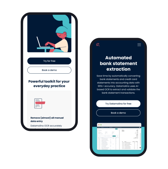
Time to bring the wireframes to life with design. We developed a web design system to ensure all visual components follow a clear hierarchy. The system includes a comprehensive typography library for consistency and readability, vector illustrations, and defined headline, color, and padding hierarchies, streamlining development and implementation.
Both desktop and mobile versions were designed and optimized for flawless responsiveness across all devices. The final design is clean, human-centric, and approachable, creating a welcoming experience for visitors.
Phase seven
Implementation
The final stage of the project was turning the approved web design into a fully functional website. We developed the website on WordPress, featuring a custom-coded visual editor with an intuitive user interface, allowing the Datamolino team to easily edit content and create new landing pages.
Each section was uniquely styled and optimized for fast loading and peak performance. We strictly adhered to the design specifications, ensuring a 1:1 match with the original design in Figma. Finally, we conducted comprehensive website optimization, including technical SEO, to ensure a fully responsive and properly configured environment.
Next steps
They say a website is never truly finished, which is why we provide ongoing support to the Datamolino team, managing additional edits and creating new landing pages or additional marketing and branding assets.
- Client: Datamolino
- Visual identity: Tamara Shawkatova
- Illustration: Katka Schwarz
- Content: Katy Mrvová
- Web development: Martin Križo
- Brand sprint workshop
- Visual identity
- Brand guidelines
- Illustration & pictogram library
- Brand & communication assets
- Web design
- Motion design
- Web development
- Copywriting
- Event marketing materials